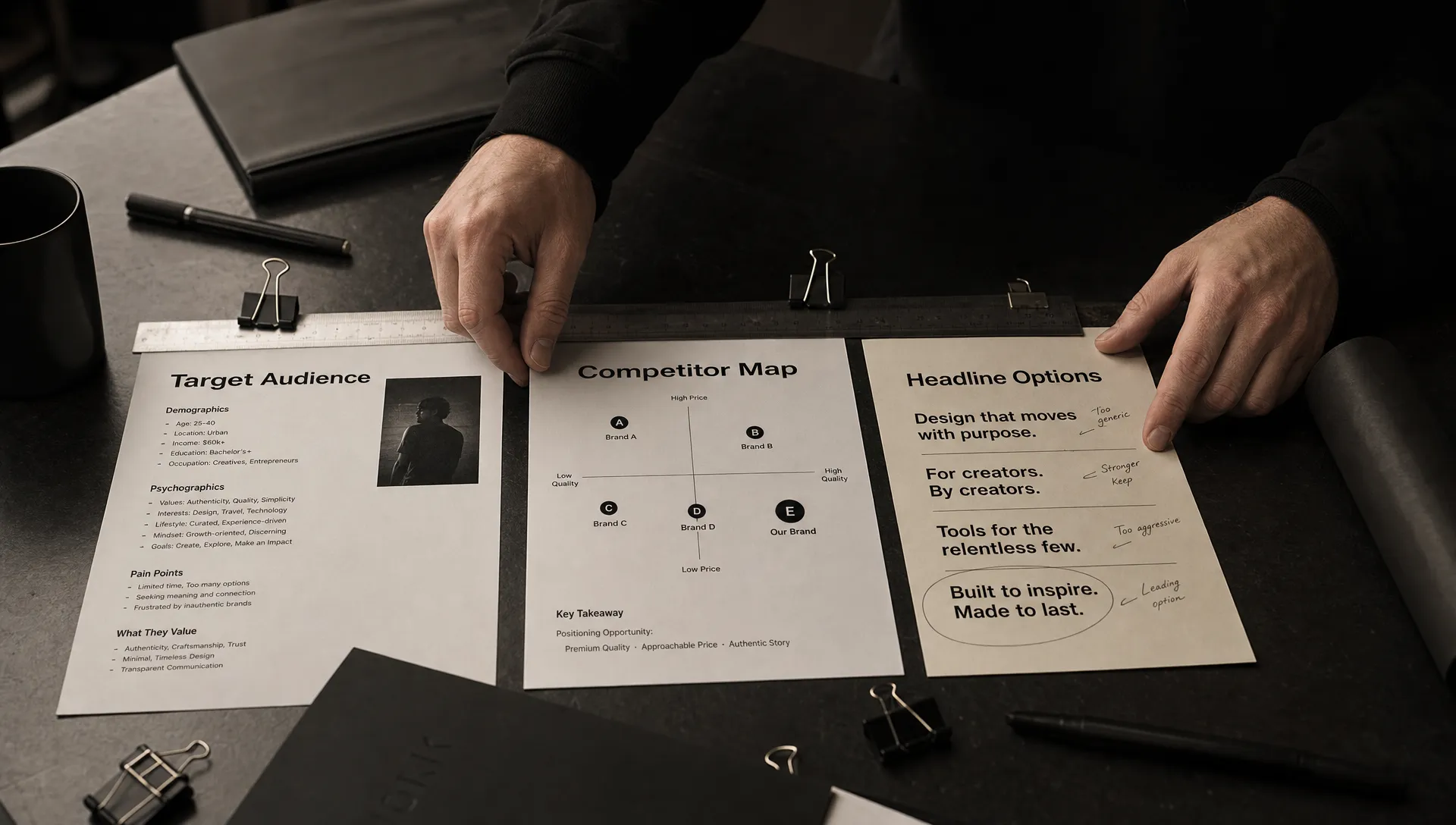
A new identity can make a business look different without giving customers a better reason to choose it. That is why rebranding graphic design should start with strategy: a clear view of who the brand needs to reach, what those people should understand and which existing perceptions need to change.
For challenger brands, this distinction matters. A bigger competitor can often outspend you. Your identity needs to make a specific advantage easier to notice and understand, not simply demonstrate that you have good taste.
Start with a perception gap, not a mood board
Before collecting visual references, describe the gap between how customers see the business today and how they need to see it tomorrow.
“We look dated” is an observation, not a useful diagnosis. Perhaps enterprise buyers mistake your specialist platform for a lightweight tool. Perhaps your product has become easier to use, but your identity still signals complexity. Or perhaps your packaging blends into a category where customers make quick decisions.
Each problem calls for a different response. Greater credibility does not automatically require muted colors. Simplicity does not automatically mean removing every detail.
Write the problem as a testable statement: “Our target buyers currently assume X, but we need them to understand Y because Z.” Support it with customer interviews, sales conversations or observed behavior. If the evidence points only to inconsistent execution, a focused refresh may be more useful than a full repositioning.
What rebranding graphic design needs from the brief
A strategic brief should reduce uncertainty without prescribing the finished design. It gives designers a problem worth solving and gives stakeholders a basis for judging the answer.
Five inputs deserve particular attention:
- Priority audience: Identify the people whose perception or behavior needs to change, including their buying context.
- Competitive frame: Establish which alternatives customers actually compare, including doing nothing.
- Relevant difference: State the advantage the business can deliver and substantiate.
- Desired response: Define what someone should understand, feel or do after encountering the brand.
- Existing equity: Identify recognizable assets that may be worth retaining rather than treating everything as disposable.
These inputs should be specific enough to rule out plausible but unsuitable ideas. “Modern, bold and human” rarely does that. “Make technical buyers recognize our specialist depth without making first-time users feel excluded” creates a more useful creative tension.
Keep execution constraints in the brief too. A name that must remain, multilingual requirements or packaging production limits can materially affect the direction. Surfacing them early prevents a team from approving an identity that cannot work where it matters.
Translate positioning into visible decisions
Good rebranding graphic design makes strategic choices visible through hierarchy, typography, imagery, color and composition. None of these elements has a universal meaning independent of its context.
A saturated color might create distinction in one category and disappear into the crowd in another. An editorial layout might suggest considered expertise, but it can also slow down a task that should be immediate.
Use a decision framework rather than a style checklist:
| Strategic requirement | Possible design response | What to check |
|---|---|---|
| Help buyers understand a complex offer | Clear hierarchy, explanatory imagery and readable typography | Can people explain the offer accurately? |
| Support a premium position | Deliberate spacing, consistent production and focused messaging | Does the experience substantiate the price? |
| Stand apart from close competitors | A distinctive combination of recognizable visual assets | Can people distinguish the brand without relying only on its name? |
| Make an unfamiliar business feel credible | Prominent evidence, clear navigation and consistent presentation | Can buyers locate and evaluate the evidence? |
These are possible responses, not formulas. The same business requirement can support several strong creative directions.
The outcome should also extend beyond a presentation deck. Boil’s guide to building a brand system rather than just a logo explores how individual choices become usable across different applications.
Make trust visible when the category demands it
Consider a research-supply business such as PeptideX Research Supplies, whose offer includes independently batch-tested compounds and published Certificates of Analysis, with products supplied strictly for research use.
For a hypothetical redesign in that category, the strategic task would include making verification information easy to find and keeping research-use limitations explicit. An attractive product page would not compensate for unclear batch documentation or imagery that implied consumer treatment benefits.
This illustrates why rebranding graphic design must account for what customers need to verify, not just what the brand wants to express. Evidence hierarchy can matter more than a dramatic visual flourish.
The same principle applies elsewhere: a professional-services buyer might need relevant experience, while a software buyer might need a clear explanation of compatibility. Design should help people evaluate the actual promise.
Evaluate creative routes against the same job
Creative reviews often drift into personal preference because the team has not agreed on evaluation criteria. One stakeholder wants more energy, another wants restraint and the founder prefers the first logo.
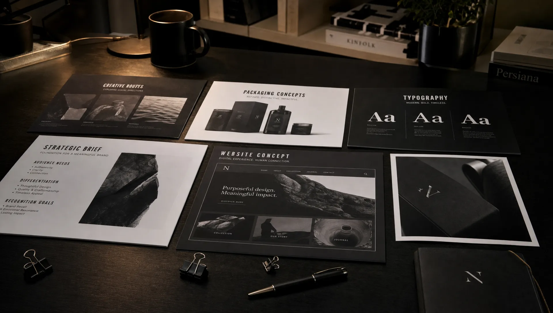
Before reviewing routes, agree on the strategic questions each direction must answer. Does it communicate the intended position? Is it distinguishable within the actual competitive set? Can it support the information customers need? Does it work in the channels that drive discovery and purchase?
Show each route through comparable applications. If one concept gets a polished campaign and another gets only a logo on white, the presentation itself biases the decision. Use the same representative website page, sales document or packaging format for each.
In rebranding graphic design reviews, ask stakeholders to connect criticism to the brief: “This feels too playful for buyers evaluating operational risk” is more useful than “I don’t like orange.” The first claim can be examined through audience research and contextual testing.
Include functional requirements in the evaluation. For digital applications, the WCAG guidance on minimum text contrast provides a concrete accessibility reference. A palette can be expressive while still giving teams accessible combinations for body text, buttons and essential information.
Preserve recognition where it still earns its place
A rebrand does not have to reject everything customers already know. Familiar colors, shapes, typography or image treatments may help people identify the business quickly, even if those assets need refinement.
Separate recognition from internal attachment. A founder’s favorite symbol is not necessarily valuable equity. Equally, a visual asset that feels tired to employees may remain useful to customers who encounter it much less often.
Look for evidence in customer conversations and recognition exercises. Show assets without the brand name where practical, then explore what people associate with them. Small qualitative exercises can expose assumptions, although they should not be treated as population-level proof.
The strategic question for rebranding graphic design is whether each asset helps the next phase of growth. Retain what supports recognition and the intended position. Change what creates confusion, limits usability or communicates a promise the business has outgrown.
Continuity can come from a combination of elements rather than an unchanged logo. Keeping a recognizable color relationship while changing typography and hierarchy may create enough connection without preserving the original problems.
Test understanding before committing to rollout
Testing should investigate whether the design performs its intended job, not simply whether respondents like it.
Give participants realistic tasks. Ask them to identify what the company offers, find evidence for a claim or distinguish it from relevant alternatives. Avoid explaining the strategy first, since that supplies context the real audience will not have.
Use existing customers and prospective buyers where both matter. Existing customers can reveal recognition risks; prospects can expose assumptions that familiarity hides. Keep the method proportionate to the decision and describe the limits of the sample honestly.
A useful evaluation separates three kinds of evidence: whether people understand the offer, whether they recognize the brand and whether the experience supports the intended action. These outcomes are related, but they are not interchangeable.
The commercial impact of rebranding graphic design also needs careful interpretation. Establish relevant baselines before launch, then monitor changes alongside pricing, distribution, campaigns and product updates. A higher conversion rate after launch does not, by itself, prove the identity caused it.
Once a direction is approved, connect it to real delivery. Boil’s rebrand implementation planning guide covers the operational work needed to carry decisions across touchpoints rather than leaving them in a guidelines document.
Frequently asked questions
What is the difference between a visual refresh and a strategic rebrand? A refresh updates expression while largely retaining the existing positioning. A strategic rebrand addresses a deeper change in audience, offer or market position, which may require changes to messaging and identity. The scope should follow the problem rather than the label.
Can an existing strategy support a new visual identity? Yes. If the positioning remains relevant and supported by evidence, there is no need to reinvent it. Confirm that the team shares the same understanding, then identify where the current identity fails to express it.
What should a rebranding graphic design brief include? Include the priority audience, perception gap, competitive context, credible difference, desired response and existing brand equity. Add practical constraints and evaluation criteria so creative work can be judged consistently.
Should customers choose the final design? Customers should inform the decision, not act as an art-direction committee. Research can reveal misunderstanding, weak recognition or usability problems. The team still needs to weigh that evidence against the strategy and implementation requirements.
Give creative work a clear commercial job
Before commissioning a new identity, write down the perception you need to change and the evidence that makes your desired position credible. That is a stronger starting point than a folder of brands you admire.
If your business needs to connect positioning, creative expression and market entry, explore Boil’s branding and go-to-market approach. Start the conversation with the growth challenge, then define what design needs to do.
