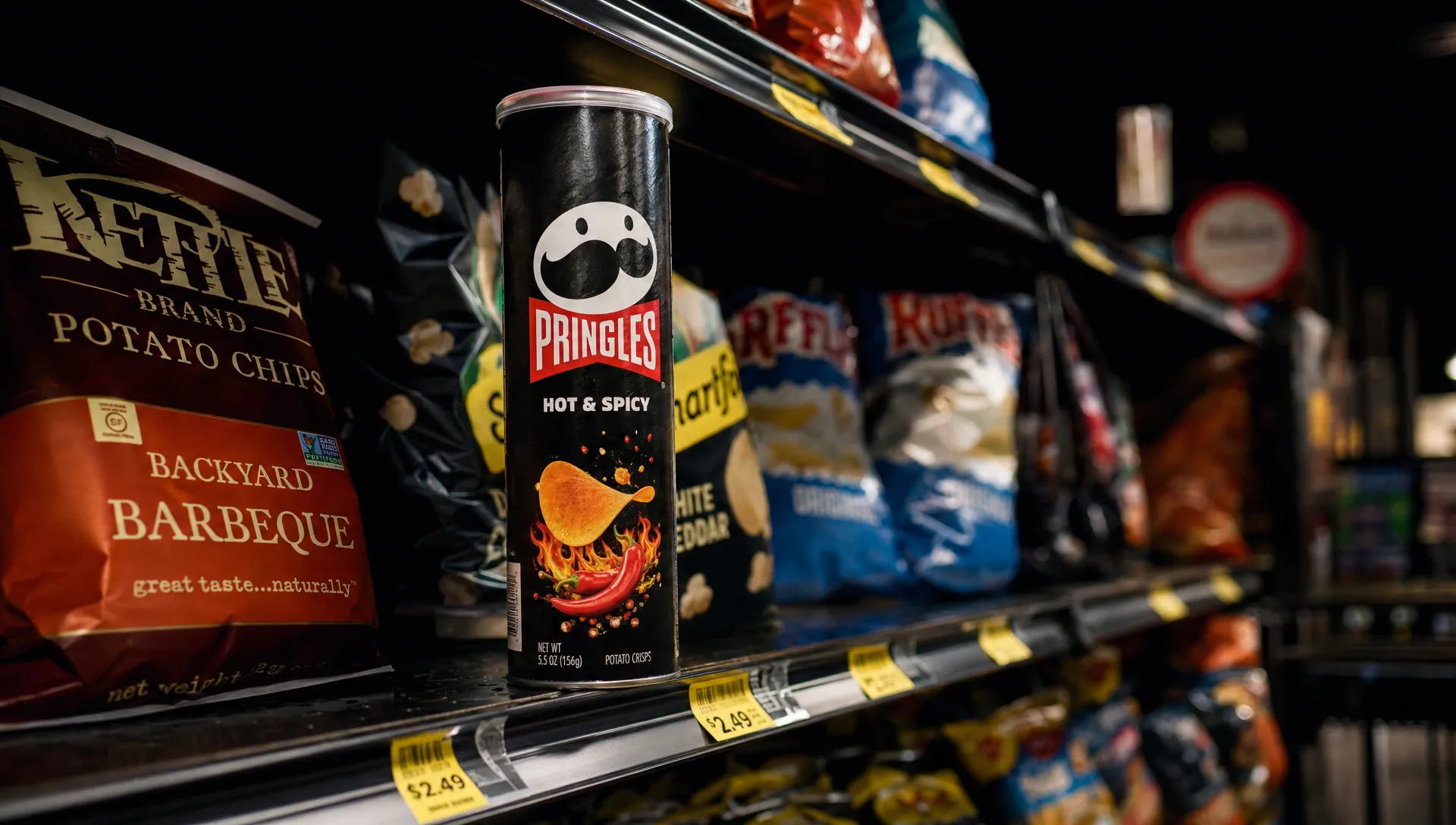
Pringles did not win its rebrand by becoming unrecognizable. It won by becoming more usable, more contemporary, and still unmistakably Pringles.
That is the tension every brand faces when it refreshes a familiar identity. Change too little and the brand feels stuck. Change too much and you spend years rebuilding the recognition you already owned. The Pringles rebrand is a useful case study because it shows a less glamorous truth about modern branding: sometimes the smartest move is not reinvention. It is sharper familiarity.
For challenger brands, this matters. The temptation is often to make a dramatic visual statement, especially when a brand feels dated or needs to compete against louder, newer players. But the best rebrands do not start with a question like, “How different can we look?” They start with, “What equity do we already have, and how do we make it work harder?”
What changed in the Pringles rebrand?
The recent Pringles identity update simplified the brand’s famous mascot, Mr. P, into a flatter, cleaner, more digital-friendly character. His round face, bow tie, moustache, and expressive eyebrows remained, but the execution became more minimal. The old dimensional look gave way to a graphic system that could flex across packaging, social content, motion, flavor variants, and small digital placements.
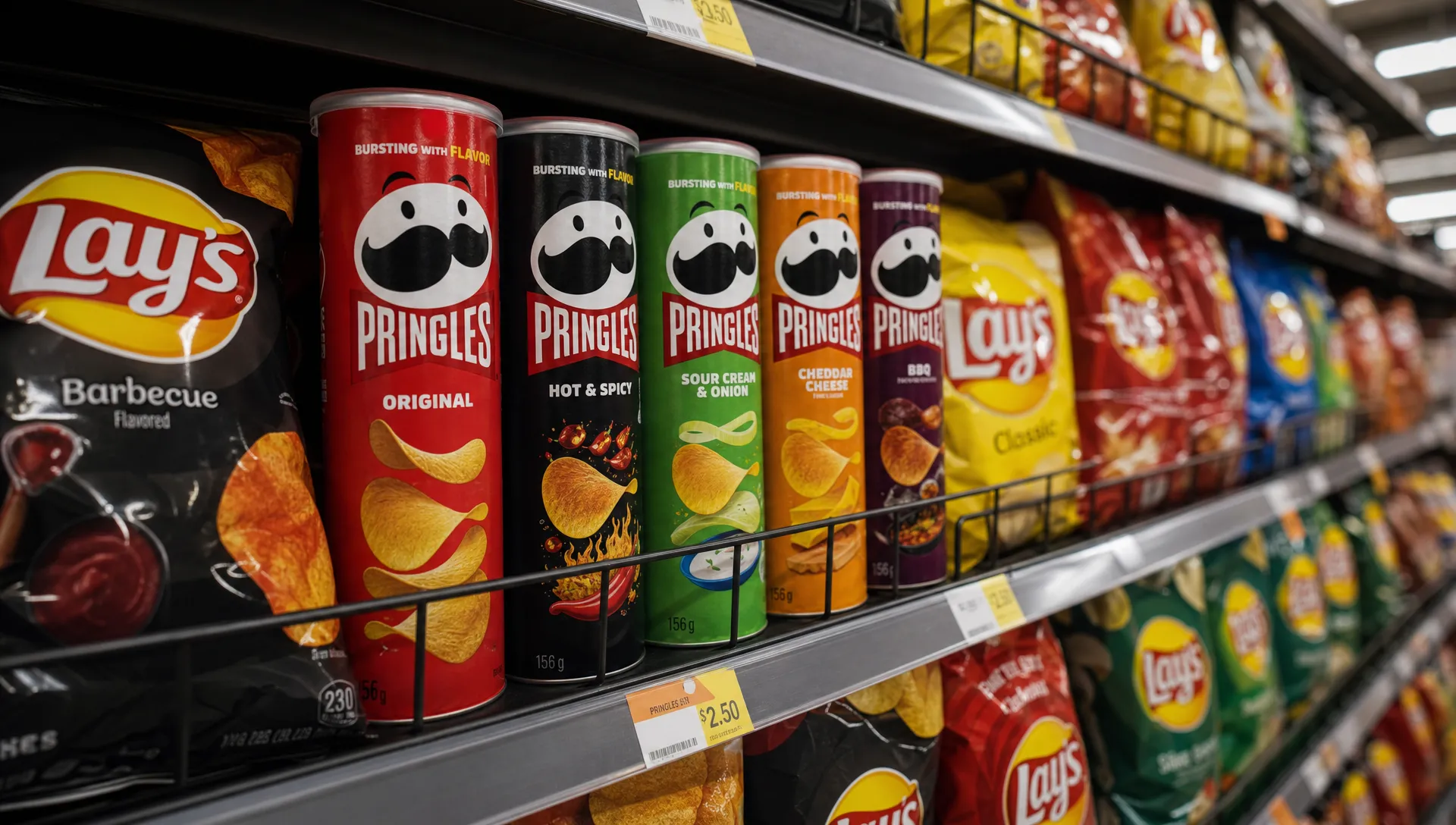
That may sound like a simple logo clean-up, but it was strategically important. Pringles is not just a snack brand. It is a shelf-recognition machine. The cylindrical can, bright flavor colors, stacked crisps, and moustached mascot all work together to make the brand easy to spot in a crowded aisle.
The rebrand modernized the system without breaking the memory structure. Shoppers could still find Pringles instantly. The mascot still felt like the same character. The packaging still held its familiar rhythm. The brand looked fresher, but it did not ask customers to relearn what they already knew.
That is why familiarity won.
Why familiarity is not the enemy of progress
A lot of rebrands overcorrect. A brand feels old, so the team strips out personality. The logo is made more geometric. The colors become safer. The typography becomes cleaner, but also less distinctive. The result may look polished in a presentation, but it can lose the signals that made the brand memorable in the first place.
Pringles avoided that trap because it treated familiarity as an asset, not a constraint.
In consumer categories, most decisions happen quickly. People are not studying packaging for minutes at a time. They are scanning, recognizing, comparing, and grabbing. In that environment, distinctive brand assets are shortcuts. They reduce friction. They help buyers find you when they are distracted, rushed, or surrounded by similar options.
For Pringles, those assets include:
- The tall cylindrical can, which is unusual in the snack aisle
- The hyperbolic, saddle-shaped crisp, which is visually tied to the eating experience
- The Mr. P mascot, especially the moustache and bow tie
- Bold flavor colors that help shoppers navigate variants
- A playful tone that fits the “once you pop” product ritual
A weaker rebrand might have decided the mascot was too old-fashioned and removed him. A more nervous brand might have hidden the can structure behind generic flavor photography. Pringles did the opposite. It kept the recognizable codes and made them easier to use.
That is the difference between modernization and erasure.
The real strategy: protect memory while improving performance
Rebranding Pringles worked because the update solved practical brand problems while protecting brand memory.
A strong identity system has to do more than look good on a hero mockup. It has to function across packaging, e-commerce thumbnails, paid social, sponsorships, limited-edition flavors, retail displays, creator content, and international markets. A mascot with too many details can become harder to reproduce. A packaging system with too much visual noise can struggle in small formats. A brand that depends on nostalgia alone can start to feel less relevant to new buyers.
The simplified Mr. P created more flexibility. The cleaner design language gave the brand a stronger foundation for motion and digital expression. The packaging could feel more contemporary without becoming anonymous.
This is the kind of decision many brands miss. They treat rebranding as a visual taste exercise when it should be a business and behavior exercise. Before changing major assets, teams should understand what customers recognize, what they value, and what is actually creating friction. That is the same principle behind a strong product rebranding strategy that protects brand equity: keep the assets that carry recognition, then upgrade the parts that limit growth.
Familiarity does not mean freezing the brand in time. It means knowing which parts of the brand are doing valuable work.
Why the mascot mattered
Mr. P is not just decoration. He gives Pringles a face, literally. In a category where many brands rely on food photography, flavor claims, and price promotions, a character can create emotional shorthand.
The genius of the refresh was that the mascot became simpler but not less himself. His hair disappeared. His face became more graphic. His eyebrows became more expressive. But the core read remained intact: round head, big moustache, bow tie, playful confidence.
That balance matters because mascots are memory devices. When audiences recognize a character, they bring years of associations with them. Remove too much and the brand becomes visually efficient but emotionally thinner. Keep too much and the brand can feel trapped in a previous era.
Pringles found the middle ground. Mr. P became easier to animate, easier to scale, and easier to deploy across modern channels. At the same time, he stayed recognizable enough to reassure existing buyers.
The brand did not ask, “How do we make Mr. P trendy?” It asked, “How do we make Mr. P work better now?”
The lesson for challengers: do not confuse attention with equity
Challenger brands often feel pressure to disrupt. That pressure can be useful. It pushes teams to avoid category sameness, sharpen their positioning, and create brands people notice. But disruption becomes risky when it ignores existing audience behavior.
If your brand already has traction, some parts of your identity may be doing more work than you realize. A rough logo, odd color, memorable phrase, or unusual packaging feature might look imperfect to the internal team but function as a recognition cue for buyers.
This applies far beyond snack brands. In any category, customers look for signs that reduce uncertainty. The same principle shows up in high-consideration local services, where a contractor like Summit Barndominiums & Outdoor Living builds trust through recognizable service categories, visible proof, and clear experience signals because buyers need familiar cues before making a major commitment.
The channel changes. The psychology does not.
Before removing an asset, ask whether it is truly outdated or simply under-designed. An old asset with strong recognition can often be refreshed. A weak asset with low recognition may need replacement. The hard part is knowing the difference.
What Pringles got right
The Pringles rebrand worked because it made several disciplined choices at once.
First, it kept the brand silhouette. The can stayed central. In a sea of snack bags, that format remains one of Pringles’ strongest physical brand assets. Changing the logo while keeping the can meant the brand could modernize without losing shelf impact.
Second, it retained the character. Mr. P may have been simplified, but he was not discarded. That protected decades of recognition and gave the brand a more flexible tool for digital storytelling.
Third, it clarified the system. A good refresh is not only about the logo. It is about how the entire identity behaves. Pringles created a cleaner structure for flavor communication, packaging hierarchy, and visual consistency.
Fourth, it changed with confidence rather than embarrassment. Some rebrands seem desperate to distance themselves from their past. Pringles did not treat its history as a problem. It treated it as leverage.
That final point is crucial. If customers already know you, the goal is not always to shock them. Sometimes the goal is to make them feel, “Yes, that is still the brand I like, and it feels more relevant now.”
When a refresh beats a full rebrand
The Pringles case is a reminder that not every brand needs a full identity reset. In fact, many established and growing brands need a refresh instead.
A refresh is usually the better move when the brand has recognizable assets, the positioning is still valid, and the customer experience does not need a radical repositioning. The challenge is execution. The brand may feel dated, inconsistent, hard to scale, or less distinctive than it should be, but its core meaning still works.
A full rebrand becomes more appropriate when the business has changed in a fundamental way. That could mean a new audience, new category, new offer, new market, merger, reputational problem, or a strategic shift that the existing brand can no longer support.
Pringles did not need to become a different snack brand. It needed to become a more modern version of itself. That is exactly where a brand refresh can beat a full rebrand, especially when recognition is already high.
For challenger brands, this distinction can save money, time, and momentum. A refresh protects what is working while removing what is slowing the brand down. A full rebrand can be powerful, but only when the business case justifies the disruption.
The hidden risk: blanding the brand
One reason people talk about the Pringles rebrand is that it sits inside a broader design trend. Many brands have simplified their identities for digital use. Cleaner logos, flatter graphics, and reduced detail often make sense. But when every brand simplifies in the same way, distinctiveness can disappear.
This is where Pringles had an advantage. The brand’s core assets were already unusual. Even when simplified, a moustached face on a tall crisp can still feels specific. The identity became cleaner, but it did not become interchangeable.
That is the warning for other brands. Minimalism is not a strategy. It is an executional style. If simplification removes the thing people remember, it is not modernization. It is dilution.
A useful test is simple: if the logo were covered, would people still recognize the brand? For Pringles, the can shape, color blocking, crisp shape, and mascot cues still do a lot of work. For brands with fewer distinctive assets, a minimal refresh can make them look like everyone else.
How to apply the Pringles lesson to your own brand
If you are considering a rebrand, do not begin with moodboards. Begin with evidence.
Look at what customers already associate with you. Review sales touchpoints, social comments, search behavior, packaging performance, customer interviews, and competitor context. Find the assets that create recognition and the assets that create confusion. Then decide what to retain, evolve, or remove.
A practical decision filter looks like this:
- Keep assets that are recognized, ownable, and connected to positive meaning
- Refresh assets that have recognition but feel dated or inconsistent
- Remove assets that confuse customers, weaken positioning, or no longer fit the business
- Add assets only when they support a clear strategic need
The launch matters too. Even a smart refresh can create confusion if customers are not guided through it. Packaging, website, sales materials, social announcements, ads, retail communications, and internal teams all need to tell the same story. If the change is subtle, explain what improved. If the change is more visible, explain what stayed the same.
That is why planning the rollout is as important as designing the identity. A thoughtful process for launching a rebrand without confusing customers helps protect trust while creating momentum.
Why familiarity still won
Pringles is proof that familiarity can be a growth advantage when it is handled with discipline.
The rebrand did not win because it was the loudest change. It won because it understood the brand’s memory structure. It kept the can. It kept the mascot. It kept the playful personality. It refined the system so those assets could perform better in a modern environment.
That is the bigger lesson for ambitious brands. You do not have to choose between relevance and recognition. The best rebrands create a bridge between the two. They make the brand easier to notice, easier to understand, and easier to remember, without forcing loyal customers to start from zero.
In other words, Pringles did not abandon what made it famous. It sharpened it.
Frequently Asked Questions
Why did the Pringles rebrand work? The Pringles rebrand worked because it modernized the mascot and packaging system while keeping the brand’s strongest recognition cues, including the can shape, moustache, bow tie, flavor colors, and playful personality.
Was the Pringles rebrand a full rebrand or a brand refresh? It was closer to a brand refresh. The brand did not change its core positioning or abandon its distinctive assets. It updated the visual system to feel more contemporary and flexible.
What can challenger brands learn from rebranding Pringles? Challenger brands can learn that distinctiveness should be protected, not casually replaced. Before making major changes, identify which assets customers already recognize and which parts of the brand need improvement.
When should a brand choose familiarity over radical change? Familiarity should be prioritized when the brand already has useful recognition, positive associations, and customer trust. Radical change is better reserved for moments when the strategy, audience, offer, or market position has fundamentally shifted.
Build a rebrand that protects what makes you memorable
A successful rebrand is not about changing everything. It is about knowing what to keep, what to sharpen, and what to leave behind.
If your brand needs to grow without losing the equity it has already earned, Boil helps ambitious challengers build sharper brands, go-to-market strategies, and digital experiences designed for market share growth.
