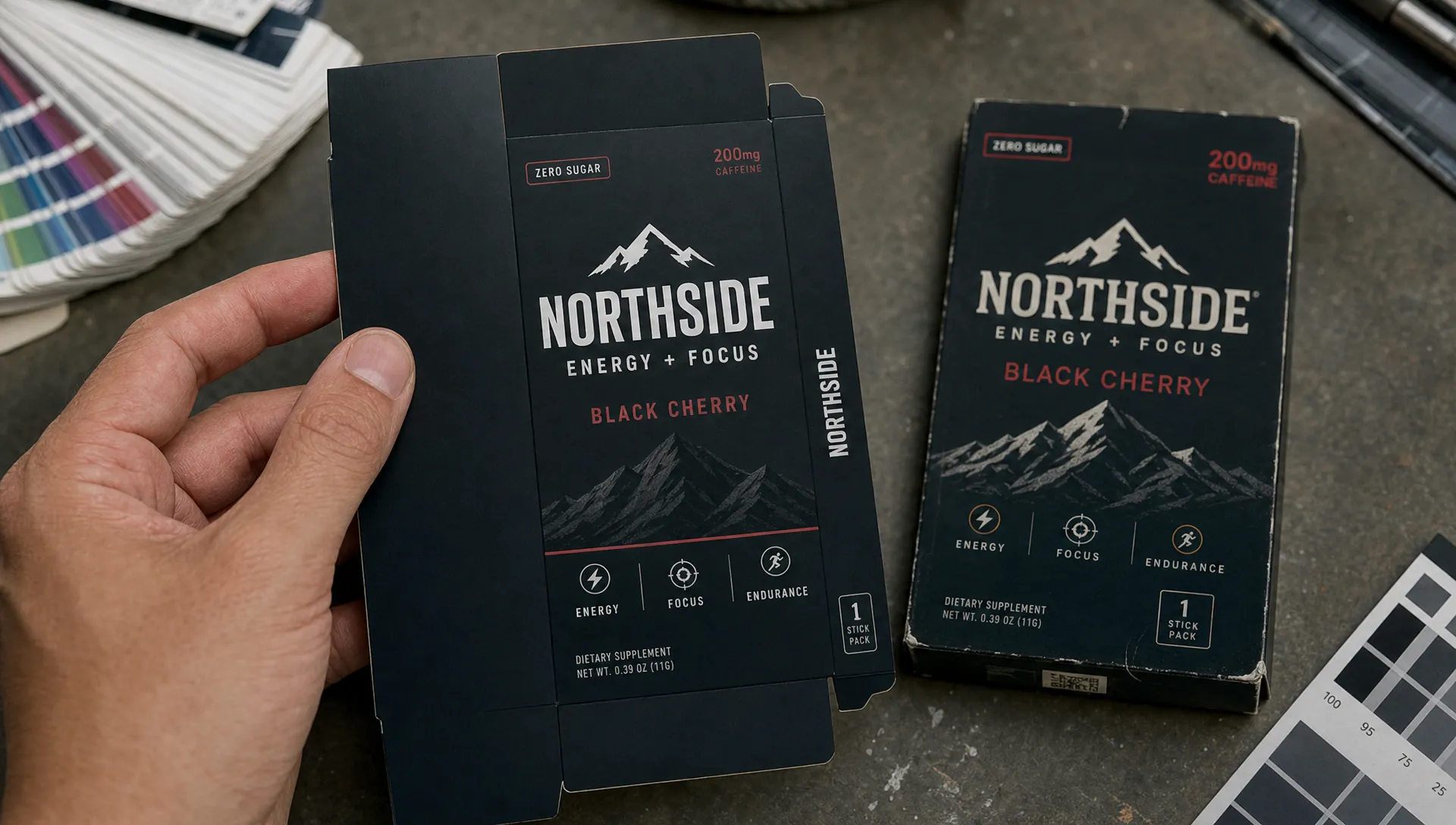
Rebranding packaging can unlock a sharper market position, signal product improvement and help a brand feel more relevant. It can also make loyal buyers walk past the product they came to buy. On a crowded shelf, people do not compare every pack with full attention. They scan for familiar cues, grab what feels right and move on.
That is why packaging change needs a different discipline than a website refresh or campaign identity. The pack is not only a brand expression. It is a navigation tool, a sales asset and often the last memory cue before purchase. The goal is not to preserve everything. The goal is to know which parts carry recognition, then change the rest with intent.
Why rebranding packaging threatens shelf recognition
Shoppers recognize patterns before details
Most packaging is noticed in fragments. Color blocks, silhouette, logo placement, product photography, typography weight and variant cues often work together before the shopper reads a single word. A loyal buyer might not describe the old pack accurately, yet still find it instantly because the system has become familiar.
That creates a design trap. In a presentation, the new pack may look cleaner, more premium or more differentiated. On shelf, surrounded by competitors and similar SKUs, it may lose the visual shortcuts that helped people locate it.
Shelf recognition is not the same as brand liking
A customer can like your new design and still fail to find it quickly. Preference testing alone can miss this problem because it often happens in isolation, away from the real buying context. The packaging must be evaluated as a memory structure, not just an aesthetic object.
Tropicana's 2009 redesign is still discussed for this reason. The issue was not simply that the new design looked bad. It removed or weakened several familiar cues at once, including the orange-and-straw image, logo orientation and overall visual architecture. The lesson is simple: when too many recognition assets change together, even a strong brand can become harder to buy.
Start with a packaging equity audit
Before rebranding packaging reaches concept design, audit what the current pack already owns in the buyer's mind. This is not a nostalgia exercise. It is a commercial filter that separates distinctive assets from design baggage.
Start by collecting the current packaging across all channels, sizes, regions and variants. Then document which elements are consistent, which are distinctive in the category and which customers or retailers associate with the product. If you already have shopper research, search data, sales by SKU, customer service feedback or retailer comments, bring it into the same review.
| Packaging asset | What to evaluate | Possible decision |
|---|---|---|
| Primary color | Is it linked to the brand or common in the category? | Keep, refine or reserve for hero SKUs |
| Logo placement | Does it guide recognition from distance? | Keep position or change gradually |
| Pack shape | Is the silhouette distinctive on shelf? | Protect if it helps fast identification |
| Product image | Does it signal usage, taste or benefit clearly? | Modernize without removing meaning |
| Variant system | Can shoppers find the right flavor, size or formula? | Simplify while preserving codes |
| Claims hierarchy | Which messages drive choice? | Clarify, reduce or reorder |
A useful packaging equity audit should end with three lists: assets to protect, assets to evolve and assets to remove. For a broader strategic view, Boil's guide to a product rebranding strategy that protects brand equity explains how to make those trade-offs before creative work begins.
Separate strategic change from shopper confusion
The safest way to approach rebranding packaging is to decide what job the change must do. A pack refresh for premiumization has different risks than one for a new audience, new category entry, sustainability shift, merger or regulatory update. If the strategic reason is vague, the redesign usually becomes a container for too many ambitions.
Ask what the old pack is failing to achieve. Is it being overlooked by younger buyers? Does it look too generic next to emerging competitors? Is the range hard to navigate? Does it undersell product quality? Each answer points to a different design move.
The discipline is to avoid changing recognition assets unless they block the strategy. If the primary color still helps shoppers find the product, it may not need to be replaced. If the logo is outdated but recognized, its proportions and location may deserve more protection than its exact styling. If the variant system is confusing, focus the redesign there instead of rebuilding the entire visual world.
Design for the shelf, not the presentation deck
Packaging concepts often win in boardrooms because they look resolved at full size on a clean slide. Retail does not offer that courtesy. Packs are partially hidden, stacked, turned sideways, viewed under inconsistent lighting and compared in seconds against competitors.
Design evaluation should include three distances. From far away, the pack needs a recognizable block or silhouette. At arm's length, it needs clear brand and variant identification. In the hand, it needs persuasive reasons to buy. A design that only performs at the final distance may look elegant but fail commercially.
This is especially important for challenger brands. A category leader can rely on distribution, mental availability and habit. A challenger often needs packaging to do more work: interrupt, reassure, explain and guide choice. That does not mean being louder than everyone else. It means choosing the few cues that must be visible first and removing the clutter that dilutes them.
A strong shelf design also respects the competitor set. If every brand is white and minimalist, a bolder color system may improve findability. If the category is visually chaotic, restraint can create contrast. The point is not to follow category codes blindly. It is to understand which codes shoppers use to make the purchase feel safe.
Refresh the system in layers
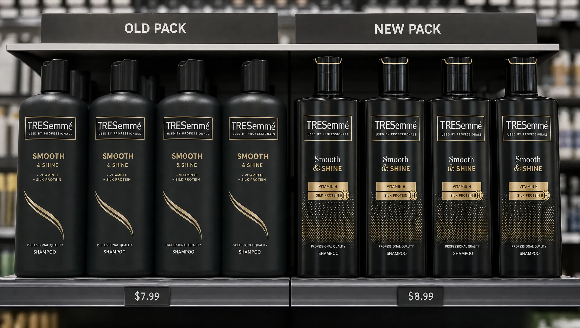
When rebranding packaging touches a full product range, the best approach is usually layered change. Keep enough continuity at the masterbrand level while improving the parts that create confusion or underperformance.
A layered system might keep the core color and logo position, then introduce a cleaner hierarchy, updated photography and stronger benefit messaging. Another brand might keep the pack shape and variant colors, but simplify the wordmark and claims. The right answer depends on the audit, not on design fashion.
This is where packaging becomes brand architecture in physical form. The masterbrand must be recognizable across the range, each product must be easy to distinguish and the system must stretch to future SKUs without becoming messy. If the redesign solves today's hero product but breaks tomorrow's innovation pipeline, it is not a system.
Boil's analysis of why familiarity still won in the Pringles rebrand is a useful reference. The brand modernized, but the moustached mascot, bold color system and cylindrical pack remained powerful anchors. Familiarity was not treated as a limitation. It was treated as leverage.
Test recognition before you commit
A packaging redesign should be tested for findability, comprehension and purchase confidence before production. You do not always need a large research budget, but you do need tests that reflect how people shop.
Use shelf mockups, quick-exposure tests or side-by-side range reviews to see whether buyers identify the brand and variant quickly. Ask people what they noticed first, what they think changed and whether they believe the product inside is still the one they trust. If customers assume the formula, quality or price tier changed when it did not, the pack may be over-signaling transformation.
Testing should include existing buyers and the growth audience. Existing buyers reveal whether you are breaking recognition. New or lapsed buyers show whether the new system improves relevance. Retailers can also provide practical feedback on shelf blocking, barcode placement, case packing and how the design performs across sizes.
Do not test only one final route. Test the level of change. A conservative route, moderate route and bolder route can show how much equity you can safely stretch. The insight is often not which design wins, but which recognition assets cannot be touched without a clear commercial reason.
Plan rollout economics and channel sequence
Treat rebranding packaging like a commercial rollout, not just a design launch. The physical nature of packaging creates costs, timing constraints and channel risks that digital brand assets do not have.
Production minimums, old stock, retailer resets, photography, ecommerce content, sales decks, point-of-sale material and trade communication all need sequencing. A rushed change can create a split shelf where old and new packs sit together with no explanation. Sometimes that is unavoidable, but it should be managed.
Finance should be in the room early. For challenger brands, cash tied up in packaging inventory can limit media, sampling or retailer support. For finance-sensitive launches, a resource such as a part-time CFO model for SMEs can help leadership model cash impact, stock write-offs and channel timing before the design hits production.
The rollout sequence should match buyer risk. High-velocity hero SKUs may need more careful bridging than long-tail variants. Ecommerce can often switch faster than retail, but it still needs updated thumbnails that preserve recognition at small sizes. Field sales teams should know what is changing, what is staying the same and how to explain the benefit in one sentence.
Build a bridge on pack and off pack
A strong rebranding packaging launch gives shoppers continuity cues during the transition. The bridge can be explicit, such as a temporary flash that says new look, same product. It can also be structural, such as keeping the same color block, pack shape or product image while other elements modernize.
The bridge should not apologize for change. It should reduce unnecessary doubt. If a recipe, formulation or size has not changed, say so clearly where relevant. If sustainability improvements affect the pack material, explain them without burying the purchase cues. If a premium repositioning includes a price change, make sure the pack gives shoppers visible reasons to believe the upgrade.
Off-pack communication matters too. Retail media, email, social content, sales sheets and ecommerce banners can all prepare customers for the new look. The key is consistency. If the launch story talks about sustainability but the shelf change looks like a luxury redesign, shoppers may misunderstand the move.
For a more complete rollout plan across touchpoints, Boil's article on launching a rebrand without confusing customers covers how to create continuity beyond the pack itself.
Mistakes that make packaging rebrands harder to buy
Packaging rebrands fail when they solve internal frustrations but ignore how buyers recognize, compare and choose products. The common mistakes are avoidable if the team keeps shelf behavior at the center of the process.
| Mistake | Why it hurts recognition | Better move |
|---|---|---|
| Changing every major cue at once | Loyal buyers lose the visual trail | Keep at least one or two strong anchors |
| Designing only for hero renders | Real shelves are messier than mockups | Test in context and at small sizes |
| Over-simplifying claims | The pack may look cleaner but say less | Keep the claims that support choice |
| Ignoring range navigation | Shoppers pick the wrong variant or leave | Build a clear SKU system |
| Launching without a bridge | People assume the product changed | Use transition messaging where needed |
The bigger mistake is treating recognition as a brake on creativity. It is not. Recognition gives the redesign something to push from. Once the team knows which assets carry memory, the creative work can be braver in the right places and more disciplined where it matters.
Frequently Asked Questions
How long should rebranding packaging take? The timeline depends on range size, production requirements, retailer schedules and testing needs. A focused refresh can move faster than a full system redesign, but physical packaging usually requires more lead time than digital identity work.
Should we keep the same colors when changing packaging? Not always. Keep colors that buyers strongly associate with your brand or product navigation. Change colors that are generic, confusing or strategically wrong, but test the impact before committing.
Do we need consumer research before a packaging rebrand? You need some form of buyer input. It can be formal research, retailer feedback, quick recognition testing or structured interviews. The point is to avoid judging the redesign only through internal taste.
What if the current packaging has low recognition? Then the redesign can take a bolder role, but it still needs a clear system. Low recognition does not mean every cue should change randomly. It means you have an opportunity to build more distinctive assets for the future.
Make the pack easier to find, trust and buy
Packaging is one of the most unforgiving brand touchpoints because it meets buyers at the moment of choice. A successful redesign makes the brand feel more relevant without erasing the cues people already use to find it.
If your brand is preparing a packaging change, start with the equity you have, decide what the new strategy truly requires and test the design in the conditions where it must sell. Boil helps ambitious challenger brands turn brand strategy, design systems and go-to-market thinking into work that can compete in the real world. Explore how Boil can help you build a rebrand that protects recognition while creating momentum.
