Your logo is no longer doing one job. It has to perform inside product interfaces, sales decks, paid ads, pitch pages, app icons, AI-generated campaign assets, social feeds, event booths, email signatures and investor updates. That is why choosing a visual identity agency in 2026 is not about finding the prettiest portfolio. It is about finding a partner that can turn strategy into a recognizable, scalable system.
For challenger brands, the stakes are even higher. You rarely have the media budget, market memory or distribution advantage of an incumbent. Your identity has to do more with less. It has to make you easier to notice, easier to understand and easier to trust, long before a buyer has time to read your full story.
In 2026, the question is not whether the design looks good. The better question is whether the identity makes your strategy visible consistently enough to change behavior.
Why visual identity has become a growth system
AI has made surface-level design easier to produce. Anyone can generate a polished logo concept, landing page moodboard or social campaign direction in minutes. That does not make visual identity less important. It makes real identity systems more valuable.
When the internet is flooded with competent-looking sameness, brands win by becoming distinctive, repeatable and strategically consistent. The role of a visual identity agency is to create the visual assets, rules and behaviors that help a brand build memory over time.
A strong visual identity should help customers answer three questions quickly:
- Who is this brand for?
- Why does it feel different from the obvious alternatives?
- Can I trust it enough to click, buy, book, recommend or invest?
That is why visual identity cannot sit apart from positioning, messaging, product experience and go-to-market. The best identity systems make commercial choices visible. They show whether a brand is premium or accessible, technical or human, rebellious or reassuring, category-defining or category-challenging.
Start with strategic diagnosis, not style exploration
Any credible visual identity agency should begin by understanding the business problem. If an agency jumps straight into moodboards, logos and color palettes, it may deliver aesthetics without leverage.
Before design begins, the agency should clarify the strategic foundations that guide visual decisions. This usually includes:
- A brand equity audit that identifies which existing assets are worth keeping, evolving or retiring.
- A competitive visual audit that maps category conventions, clichés and white space.
- Audience insight that explains what buyers need to believe before they choose you.
- Positioning clarity that defines the role your brand wants to own in the market.
- Touchpoint analysis that shows where the identity must work hardest.
- Operational constraints such as team size, content volume, localization, product complexity and budget.
This is especially important for challengers. If you are trying to steal share from larger competitors, your visual identity needs to sharpen the market position, not decorate it. If that foundation is still unclear, start with a positioning exercise first. Boil’s guide to owning your brand market position is a useful place to pressure-test whether your strategy is specific enough.
The core deliverables a visual identity agency should provide
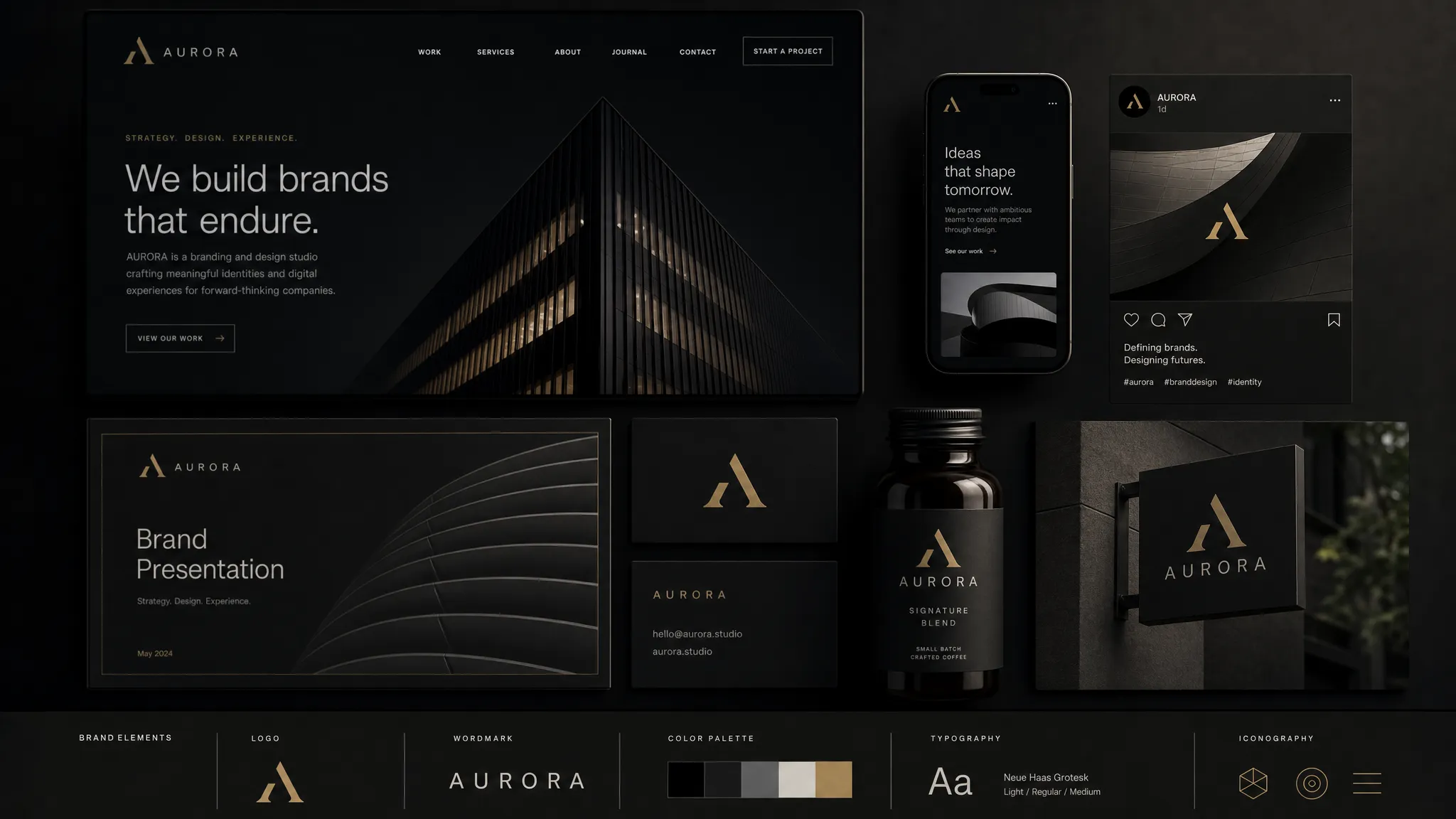
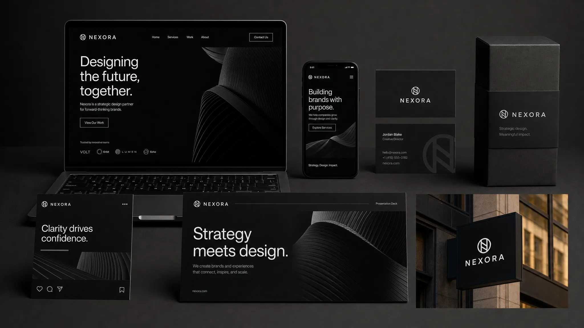
A modern identity project should result in more than a logo file and a brand guideline PDF. You should receive a working system that your team can use across real-world channels.
A central creative idea
The identity should be built around a clear creative idea, not a random combination of visual preferences. This idea translates strategy into form. It explains why the brand looks, feels and behaves the way it does.
For example, a cybersecurity challenger might need an identity that communicates calm control rather than fear. A sustainable consumer brand might need to feel regenerative and practical rather than preachy. A fintech brand entering a trust-sensitive market might need to balance innovation with institutional confidence.
The agency should be able to explain the design logic in business language. If the only rationale is that it feels modern, bold or premium, the thinking is not yet deep enough.
A logo system, not a single logo
A logo still matters, but only as part of a flexible system. In 2026, a logo must work across tiny app icons, dark-mode interfaces, social avatars, motion graphics, event signage, website headers, presentation covers and partnership lockups.
A complete logo deliverable should include primary and secondary versions, responsive variations, symbol and wordmark usage, spacing rules, minimum sizes, file formats, color variations and misuse examples. It should also include practical rules for co-branding, product sub-brands or future business units if your brand architecture requires it.
The test is simple: can a non-designer use the logo correctly without asking the agency every time? If not, the system is incomplete.
A distinctive color and typography system
Color and typography are among the most powerful memory-building assets a brand has. But they also carry risk. Many brands choose colors because they look appealing in a presentation, then discover they fail in accessibility, product UI, print, outdoor media or global markets.
A serious agency should deliver color roles, not just color swatches. That means defining primary brand colors, supporting colors, functional UI colors, contrast rules, background pairings, campaign flexibility and dark-mode behavior. Accessibility should be treated as a design requirement, not a late-stage fix. The WCAG 2.2 guidelines from the World Wide Web Consortium remain an important reference point for digital contrast, readability and inclusive experience design.
Typography should be equally practical. The agency should specify headline, body, interface and fallback typefaces, plus usage rules for hierarchy, spacing, licensing and multilingual needs. A challenger brand can look distinctive while still being readable, fast and usable.
Imagery, illustration, iconography and motion
Visual identity is not only made of logos, colors and type. The agency should define how your brand shows people, products, environments, data, abstract concepts and proof.
That may include photography direction, illustration style, icon systems, product mockup rules, composition principles, image treatment, data visualization and motion behavior. These choices shape whether your brand feels generic or ownable.
Motion is now part of identity for many brands. Logo animation, product transitions, social video rules and campaign idents can make a brand more recognizable in fast-moving channels. If launch films, business promos or founder videos are part of the rollout, a strong agency will either produce them or collaborate with specialists, such as a cinematic video production partner, while preserving brand consistency through direction, editing and color grading.
Digital and product expression
In 2026, no identity is complete until it has been tested in digital environments. A brand can look excellent in a static poster and collapse inside a homepage, SaaS dashboard, ecommerce product page or onboarding flow.
A visual identity agency should show how the system behaves across key digital surfaces. At minimum, that should include website sections, landing pages, social formats, email templates and paid media examples. For product-led or app-based businesses, it should also include UI expression, component styling, icon behavior, empty states, loading states and interface typography.
This is where many identity systems succeed or fail. If the identity cannot support conversion, comprehension and usability, it becomes a campaign skin rather than a brand system.
Editable templates and launch assets
When visual identity lives only inside a beautiful PDF, it dies the first time a salesperson builds a deck at 11 p.m. A strong agency should create assets your team can actually use.
Depending on your business, that may include pitch decks, sales one-pagers, proposal templates, social media templates, ad formats, email signatures, recruitment assets, event materials, investor slides, case study templates, packaging rules or product launch kits.
The point is not to design every asset you will ever need. The point is to create enough examples and editable templates that your team can execute consistently without slowing down.
Brand guidelines that enable speed
Guidelines should not read like brand police documentation. They should help people make better decisions faster.
Useful guidelines explain the idea behind the identity, define the system clearly and show real examples of correct use. They should include enough rules to protect consistency, but not so many that the brand becomes rigid.
The best guidelines answer practical questions: Which color should we use for conversion buttons? How do we design a LinkedIn carousel? What does an on-brand product screenshot look like? How should a partner logo appear beside ours? What should AI-generated imagery never do? What happens when we need to make a quick campaign asset tomorrow?
A visual identity agency should connect design to go-to-market
A visual identity is not launched in a vacuum. It arrives in the market through a website, campaign, sales conversation, PR announcement, product experience and internal rollout. If those moments are disconnected, the identity may generate attention without changing perception.
That is why the agency should help translate the identity into go-to-market behavior. This can include launch messaging, campaign concepts, landing page direction, sales enablement, internal training and a rollout plan that explains what changes, what stays the same and why it matters.
For rebrands, this is critical. Customers, employees and partners need a narrative that makes the change feel intentional. For new brands, the launch needs to build recognition quickly. For challengers, the identity should make the market tension visible and help buyers understand why the brand deserves attention now.
If you want a wider view of what a modern agency engagement should include, Boil’s breakdown of branding agency services in 2026 explains how strategy, identity, digital experience and activation fit together.
The 2026 standard: AI-ready identity systems
AI will continue to change how brand assets are produced. That makes governance more important, not less important.
A visual identity agency should help your team use AI without diluting distinctiveness. That means creating rules for what can be generated, what must be designed manually and what needs human approval.
An AI-ready identity system may include:
- Prompt principles for generating on-brand imagery, layouts or campaign variations.
- Visual guardrails that define prohibited styles, compositions, colors or clichés.
- Review workflows for approving AI-assisted assets before publication.
- Examples of acceptable and unacceptable AI-generated outputs.
- Asset naming and versioning rules so teams do not lose control of the system.
- A clear point of view on where human creativity, judgment and craft remain essential.
The goal is not to make every asset identical. The goal is to keep the brand recognizable while production becomes faster and more distributed.
What to test before launch
Preference is a weak way to evaluate identity. People can like a concept that does nothing for the business, or initially dislike a concept that becomes memorable and commercially powerful over time.
A better agency will help you test the identity against strategic criteria. The exact method depends on budget, timeline and risk, but the questions should be practical:
- Does the identity make the brand easier to recognize in the category?
- Does it support the intended positioning?
- Does it preserve valuable existing equity where needed?
- Does it improve clarity on the website or product experience?
- Does it increase trust with the target audience?
- Can internal teams use it without constant interpretation?
For high-stakes rebrands, validation might include customer interviews, stakeholder workshops, landing page tests, internal adoption pilots or controlled campaign experiments. The point is not to remove judgment from design. The point is to make the judgment better informed.
Red flags when choosing a visual identity agency
Not every visually impressive agency is right for a growth-focused brand. Some studios are excellent at creating beautiful work, but less equipped to connect that work to positioning, digital performance or go-to-market reality.
Watch for these warning signs:
- The agency cannot explain the strategic reason behind its portfolio work.
- The proposal focuses on logos and moodboards, but not systems, templates or rollout.
- The process relies mainly on stakeholder taste instead of market insight.
- Accessibility, UX and digital implementation are treated as separate problems.
- The deliverables are not editable or usable by your internal team.
- The agency avoids hard conversations about differentiation, category conventions or existing brand equity.
A good partner should challenge you. If every early conversation feels like order-taking, the agency may be optimizing for approval rather than impact.
What success should look like after launch
The success of a visual identity project is not measured only by applause on launch day. The real test happens over the next weeks and months, when the identity is used by marketing, sales, product, leadership and partners.
Strong outcomes often show up as better consistency across channels, faster asset creation, clearer sales materials, stronger website comprehension, improved campaign recognition, higher internal confidence and more coherent customer perception. For some brands, it may also influence conversion, recruitment, PR response or investor confidence, although those outcomes depend on more than identity alone.
For challenger brands, the biggest win is often sharper market memory. People start to recognize you faster. They can describe you more clearly. They understand what makes you different without needing a long explanation.
That is what a visual identity agency should ultimately deliver: not decoration, but a system that helps your brand become easier to remember and harder to ignore.
Frequently Asked Questions
What does a visual identity agency do? A visual identity agency translates brand strategy into a visual system. That usually includes logo, color, typography, imagery, layout, motion, templates, guidelines and implementation support across digital and physical touchpoints.
How is visual identity different from branding? Branding is the broader system of positioning, story, messaging, experience and perception. Visual identity is the visible expression of that system. A strong identity should make the brand strategy easier to recognize and remember.
How long does a visual identity project take? Timelines vary by scope, stakeholder complexity and implementation needs. A focused refresh can move faster, while a full identity system with research, digital design, templates and launch support often takes several months.
Should a visual identity agency also design the website? Not always, but the agency should understand digital execution. If your website is a major commercial touchpoint, identity and web design should be closely connected so the brand does not fall apart in real customer journeys.
Do we need a full rebrand or just a visual refresh? If your positioning, audience and offer are still right, a visual refresh may be enough. If the market no longer understands your value, your category has shifted or your brand is blocking growth, you may need a deeper strategic rebrand.
Build an identity that can carry growth
If your brand needs more than a new look, Boil can help connect visual identity to positioning, digital experience and go-to-market execution. We work with ambitious challenger brands that need to stand out, grow market share and turn strategy into market-ready creative systems.
Explore how Boil helps challenger brands grow or use our guide on how to choose a creative design agency to compare potential partners with sharper criteria.