2021 was an unusually revealing year for branding. Companies were emerging from a period of lockdowns, digital acceleration, supply chain pressure and changing customer expectations. Some needed a clearer digital presence. Others needed to signal a strategic pivot, distance the corporate brand from legacy perceptions or show that they had outgrown a narrow category.
That is why the biggest 2021 rebrands are still worth studying. The strongest ones were not cosmetic refreshes. They used identity as a business tool, translating a real strategic change into assets people could recognize, understand and remember.
For challenger brands, the lesson is direct: a rebrand works when it creates commercial clarity. The logo matters, but the reason behind the logo matters more.
Why 2021 produced so many major rebrands
By 2021, brands were operating in markets that had changed faster than their identities had. Digital-first buying had become normal, employer brands were under more pressure, categories were blurring and legacy businesses were trying to prove they still had a place in the future.
That created three common rebrand triggers:
- Strategic expansion: Companies had outgrown a product-specific name or identity.
- Category repositioning: Legacy brands needed to look credible in new markets such as EVs, fintech, science or digital experiences.
- Cultural relevance: Some brands had to respond to shifts in public expectations and social values.
The best 2021 rebrands made those shifts visible without abandoning what made the brand recognizable in the first place. That balance is difficult. Go too far and you lose trust. Stay too close to the past and the market does not register the change.
Burger King: bringing appetite back to the brand
Burger King’s 2021 rebrand became one of the most praised identity projects of the year because it understood the emotional job of a fast-food brand. The company moved away from the glossy, blue-accented identity it had used since 1999 and returned to a warmer, flatter look inspired by its earlier visual heritage.
What it got right was not nostalgia for its own sake. The retro-inspired logo, chunky typography and rich food colors made the brand feel more tactile and appetizing. The identity looked like it belonged on packaging, uniforms, signage, app screens and social posts, which is exactly where a modern quick-service restaurant brand has to live.
The move also aligned with a broader product story. Burger King had been investing in food quality cues, including removing artificial colors, flavors and preservatives from menu items in several markets. The new identity supported that message visually. It felt less synthetic and more flame-grilled.
The key lesson is that heritage can be a growth asset when it is edited through a modern lens. Burger King did not simply copy an old logo. It rebuilt an entire system around distinctive equities people already associated with the brand: warmth, indulgence, flame and boldness.
Pfizer: turning a pharmaceutical logo into a science signal
Pfizer entered 2021 with a level of public visibility few pharmaceutical companies ever experience. Its role in COVID-19 vaccine development had pushed the company from industry recognition into mainstream conversation. A brand identity built around a pill shape no longer captured the company’s story.
The 2021 rebrand replaced the pill-like oval with a double-helix-inspired symbol. This was a smart strategic move because it shifted the brand from products to science. Pfizer was not just selling medicine, it wanted to be seen as a research-led company built around breakthroughs.
The timing mattered too. In a high-trust, high-scrutiny sector, the identity had to feel modern without looking fashionable. The blue color system preserved continuity, while the new symbol gave the company a more dynamic language for digital touchpoints, corporate communications and scientific storytelling.
For B2B, health and technology brands, Pfizer’s rebrand is a reminder that visual identity should evolve when the value proposition evolves. A company can be known for one thing for decades, then need a broader story because its future market is different from its past market.
Kia: making the ambition impossible to miss
Kia’s 2021 rebrand was bold enough to be divisive, which is often the price of trying to change perception quickly. The company introduced a new angular logo and the slogan “Movement that inspires,” supporting its transition from a value-oriented car manufacturer to a mobility brand with serious EV ambitions.
What Kia got right was the scale of the signal. A small visual refresh would not have matched the company’s strategic direction. Kia needed to tell the market, dealerships, employees and future customers that the brand was not just updating its cars. It was changing its role in the mobility category.
The logo attracted criticism for legibility, with some people reading it incorrectly at first glance. That critique is fair. But the broader brand move still did important work. It created a clean break from older perceptions and gave Kia a more future-facing platform for vehicles like the EV6.
The challenger-brand takeaway is that high-ambition repositioning often requires visible tension. If the market has a fixed idea of who you are, polite design may not be enough to move it. The risk is worth taking only when the business change underneath is real.
Peugeot: using heritage to move upmarket
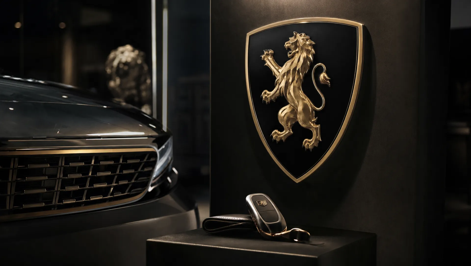
Peugeot’s 2021 rebrand leaned into a premium, heraldic look with a lion’s head inside a shield. Like Burger King, Peugeot drew from its own history. Unlike Burger King, the goal was not warmth and appetite. It was sophistication, confidence and upward movement.
The rebrand arrived as Peugeot was trying to sharpen its position inside the Stellantis portfolio and compete more strongly in a market where design, electrification and perceived quality matter. The new crest gave the brand a more premium retail presence and translated well across grilles, digital interfaces, dealerships and merchandise.
What Peugeot got right was coherence. The identity looked like it belonged to the cars the company wanted to sell next, not just the cars it had sold before. That is a crucial distinction. Rebranding should not simply decorate the current business. It should create an identity that can stretch into the next version of the business.
For challenger brands moving into a higher-value segment, Peugeot shows the value of restraint. Premium rebrands often fail when they confuse luxury with minimalism or seriousness with blandness. Peugeot kept character in the system while making the brand feel more elevated.
Wise: simplifying the name to match the broader offer
TransferWise becoming Wise in 2021 is one of the cleanest examples of a rebrand driven by product expansion. The original name was highly effective when the company was mainly associated with international money transfers. As the business expanded into multi-currency accounts, cards and broader financial services, “TransferWise” became too narrow.
The shorter name kept valuable brand equity while removing a constraint. It still sounded familiar, but it no longer boxed the company into a single use case. That is exactly what a name change should do when a brand has earned trust in one category and needs permission to enter adjacent ones.
The rebrand also avoided over-explaining itself. Wise is simple, memorable and tied to a customer benefit: making smarter decisions with money. For fintech brands, where trust and clarity are essential, the name helped the company feel more mature without losing accessibility.
This is a useful lesson for any business with a descriptive name. Descriptive names can be powerful early on because they tell customers what you do. At scale, they can become limiting if the company’s value expands beyond the original descriptor.
GM: making the EV pivot public
General Motors’ 2021 identity update was built around its electric vehicle ambitions and its “Everybody In” campaign. The new lowercase gm logo, blue gradient and rounded form were designed to signal a more digital, electric future.
The execution received mixed reactions, especially from designers who felt the mark lacked the authority of the previous identity. Still, the strategic intent was clear. GM needed to show that electrification was not a side project. It was central to the company’s future.
That is what the rebrand got right: it connected corporate identity to a business transformation. When a legacy company enters a new growth arena, customers, investors, partners and talent all need evidence that the shift is serious. A rebrand cannot prove the transformation alone, but it can make the commitment easier to see.
The caution is that future-facing design must still carry enough brand confidence. If a rebrand tries too hard to look like a startup, an established company may dilute the credibility it has spent decades building.
Meta: separating the corporate brand from the social app
Facebook’s 2021 corporate rebrand to Meta was the most culturally visible rebrand of the year. It was also one of the most debated. The company wanted to signal a shift toward the metaverse and create a clearer distinction between the corporate entity and the Facebook app.
From a brand architecture perspective, the move solved a real problem. Facebook had become both the name of a social platform and the name of a parent company that also owned Instagram, WhatsApp, Messenger, Oculus and other initiatives. Meta gave the corporate brand a broader strategic container.
What it got right was clarity of intent. Whether or not people agreed with the metaverse bet, they understood that the company was announcing a future direction. The rebrand made the strategy impossible to ignore.
The limitation was trust. A name change cannot erase reputational issues. If the market believes a rebrand is being used to distract from deeper problems, the identity will be judged through that lens. Meta is a strong reminder that brand strategy and corporate behavior cannot be separated. Rebranding can introduce a new story, but the company has to earn belief over time.
Block: fixing the architecture before the portfolio outgrew Square
Square Inc. became Block in December 2021, and the logic was straightforward. Square had started as a payments product for sellers, but the company’s portfolio had expanded to include Cash App, TIDAL, Spiral and other initiatives. Keeping Square as the corporate name risked making the parent brand feel smaller than the business had become.
Block worked because it protected the equity of Square while creating space above it. The seller business could remain Square, while the parent company gained a name broad enough to hold multiple ventures. That is strong brand architecture.
This is especially relevant for ambitious companies that grow through new products, acquisitions or platform expansion. A product brand can become so successful that it starts limiting the parent company. When that happens, the answer is not always to rename everything. Often, the smarter move is to create a clearer hierarchy.
Square to Block also shows that corporate rebrands do not always need to target consumers directly. Sometimes the audience is investors, partners, employees, recruits and the industry ecosystem. If those groups understand the company’s structure more clearly, the rebrand has done its job.
Cleveland Guardians: responding to cultural change with local meaning
The Cleveland baseball team announced its move from Indians to Guardians in 2021, with the new name taking effect for the 2022 season. Sports rebrands are uniquely difficult because fans build identity, memory and community around team names. That makes any change emotional.
What the Guardians rebrand got right was rooting the new name in place. The name referenced the Guardians of Traffic statues on Cleveland’s Hope Memorial Bridge, giving the identity a local foundation rather than a generic replacement. It also allowed the organization to move away from a name that had long faced criticism from Native American groups and other stakeholders.
The rollout had challenges, including fan resistance and logistical complexity. But strategically, the rebrand acknowledged that cultural context changes. Brands with long histories cannot assume that inherited symbols will remain acceptable or effective forever.
For organizations facing a values-based rebrand, the main lesson is to avoid empty abstraction. If a brand must leave behind a controversial identity, the new one needs its own meaning. Local relevance, community input and a clear explanation help people understand what the brand is moving toward, not only what it is moving away from.
What the best 2021 rebrands had in common
Looking across the biggest 2021 rebrands, the winners shared a few strategic patterns. They did not all produce universally loved logos, but they all used identity to make a business shift visible.
First, they had a reason beyond design taste. Burger King wanted to restore appetite and distinctiveness. Pfizer needed to express science. Kia and GM were signaling mobility and EV futures. Wise and Block needed room to grow. Meta needed a corporate container for a bigger bet. The strongest rebrands were answers to business problems.
Second, they protected or reinterpreted existing equity. Burger King kept its warmth and heritage. Peugeot kept the lion. Wise kept a connection to its original name. Even when the change looked dramatic, the best projects gave customers something familiar to hold onto.
Third, they were built as systems. A modern rebrand has to work across packaging, retail, apps, investor decks, hiring campaigns, product interfaces and social content. That is why rollout thinking matters as much as the mark itself. In content-heavy categories, the same principle applies to execution tools: an AI-powered real estate video platform like Diane can help agencies turn listings into polished, brand-consistent videos across channels, which is often where a brand is truly experienced by customers.
Finally, the best 2021 rebrands had internal ambition. They were not just announcements to the market. They gave employees and partners a clearer story about where the organization was going.
If you want a broader view of why some rebrands become long-term assets, Boil’s breakdown of the best rebrands of all time and why they worked is a useful companion to these 2021 examples.
Lessons challenger brands can apply now
Challenger brands often rebrand under pressure: growth has stalled, the category has shifted, a bigger competitor is copying the offer or the brand no longer reflects the quality of the product. The 2021 examples show that a rebrand can be a powerful growth lever, but only when it is tied to a sharper commercial thesis.
Before changing your identity, ask what the rebrand must make easier. Should customers understand your offer faster? Should the sales team have a stronger story? Should the brand attract a higher-value segment? Should the company create space for new products? Should the market stop comparing you to the wrong competitors?
A useful rebrand brief should define:
- The business problem the current brand cannot solve
- The audience perception that needs to change
- The brand assets worth keeping
- The strategic shift the identity must signal
- The channels where the new brand must perform immediately
This prevents a rebrand from becoming a style exercise. It also makes creative decisions easier. If the goal is market entry, the brand may need clarity and category cues. If the goal is premium repositioning, it may need restraint and sharper storytelling. If the goal is product expansion, naming and architecture may matter more than visual expression.
For a more practical step-by-step process, Boil’s complete rebranding guide covers the strategic foundations that should come before design exploration. And if you are evaluating more recent identity moves, the agency’s review of successful rebrands in 2024 shows how the same principles continue to appear in newer examples.
Frequently Asked Questions
What were the biggest 2021 rebrands? Some of the biggest 2021 rebrands included Burger King, Pfizer, Kia, Peugeot, Wise, GM, Meta, Block and the Cleveland Guardians. Each reflected a different strategic need, from product expansion to cultural change.
What made the best 2021 rebrands successful? The strongest 2021 rebrands were tied to clear business shifts. They did not only update logos. They clarified positioning, improved brand architecture, modernized digital performance or made a future strategy easier to understand.
Was Meta a successful rebrand? Meta was successful in one specific sense: it separated the parent company from the Facebook app and made the company’s strategic direction clear. Its long-term success is harder to judge because trust, product adoption and corporate behavior all influence how the brand is perceived.
Why do companies rebrand instead of refreshing their logo? A logo refresh updates visual expression, but a full rebrand addresses deeper issues such as positioning, audience perception, naming, architecture, messaging and market relevance. Companies usually rebrand when the current identity no longer supports the business strategy.
What can challenger brands learn from 2021 rebrands? Challenger brands should treat rebranding as a growth decision, not a design preference. The best rebrands define what perception needs to change, what equity should be protected and how the new identity will help the business compete more effectively.
Make your rebrand a growth move, not a cosmetic update
The biggest 2021 rebrands worked because they were connected to strategy. They helped companies signal new ambitions, simplify complex portfolios, reclaim distinctive assets or respond to changing expectations.
If your brand no longer reflects where your business is going, Boil can help turn that tension into a sharper identity, clearer go-to-market story and stronger digital experience. Start with the strategic reason for change, then build the brand system that helps you grow market share with confidence.
