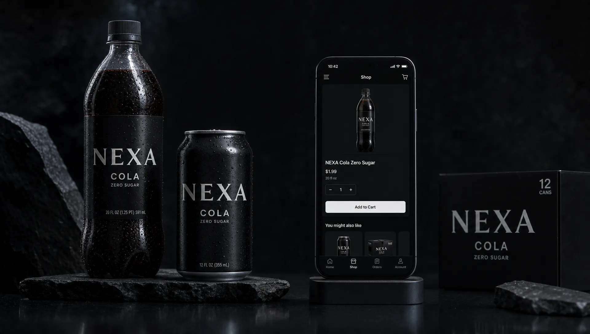
Rebranding Coca-Cola is the kind of brief that sounds simple until you remember what is really being redesigned. It is not just a logo, a can, a bottle, or a campaign line. It is more than a century of memory, habit, ritual, shelf recognition, and cultural meaning compressed into a few seconds of attention.
That is why rebranding Coca-Cola is such a useful thought experiment for any ambitious brand. Most companies will never operate at Coca-Cola's scale, but every brand faces the same core tension: how do you evolve without becoming less recognizable?
For challenger brands, the lesson is not to copy Coca-Cola's red, script, or nostalgia. The real lesson is discipline. Distinctiveness is built by repetition, protected by strategy, and modernized with care.
Why Coca-Cola is such a dangerous brand to redesign
Coca-Cola is not famous because of one asset. It is famous because many assets work together: the red and white color world, the Spencerian script, the contour bottle, the ribbon, the feeling of refreshment, the sound of opening a bottle, and decades of advertising that connect the drink to social moments.
A weaker brand can often redesign because there is not much memory to disrupt. An iconic brand has the opposite problem. Every change has an audience that notices. Customers may not be able to explain the design system, but they know when something feels off.
The 1985 New Coke episode is still a useful warning because it showed that people do not only buy a formula. They buy meaning. When a brand becomes part of routine and identity, change can feel like loss if it is not framed, tested, and managed carefully.
That does not mean Coca-Cola should never evolve. It has evolved many times. The difference is that its best changes protect the cues people use to recognize the brand before they read a word.
What the distinctive edge actually is
A distinctive edge is not the same as a beautiful identity. It is the set of brand cues that help buyers notice, remember, and choose you in the real world. Distinctive assets reduce the work a customer has to do. They make a brand easier to find on a shelf, in a fridge, on a menu, in an app, or inside a social feed.
For Coca-Cola, the most valuable cues would likely include:
- The red and white palette because it creates immediate shelf recognition and emotional warmth.
- The script logo because it carries heritage, familiarity, and global consistency.
- The contour bottle silhouette because it can signal the brand even without a label.
- The dynamic ribbon because it adds movement and a familiar framing device.
- The tone of refreshment and togetherness because the brand has long connected itself to shared moments.
A rebrand that removes these cues for the sake of looking cleaner would be a strategic mistake. Modernity is not valuable if it makes the brand harder to recognize.
The real brief is not make it new
The real brief would be: make Coca-Cola easier to use in today's world without making it harder to identify.
That distinction matters. A modern brand system must work across retail shelves, delivery apps, global campaigns, vending machines, stadium signage, social video, limited editions, sustainability messaging, and product variants. The challenge is not simply visual taste. It is operational clarity at massive scale.
A smart Coca-Cola rebrand would start with business questions, not moodboards. Is the goal to improve portfolio navigation? Make digital commerce clearer? Refresh relevance with younger audiences? Create more consistency across global markets? Support new product lines? Each answer changes the design problem.
Principle 1: Audit memory before design
Before changing anything, the brand team would need to know which assets carry recognition and which assets are only internal favorites. This is where many rebrands go wrong. Teams confuse familiarity inside the company with fame in the market.
A proper audit would examine recognition, uniqueness, meaning, and behavior. Can people identify the brand from color alone? Does the bottle shape still trigger recall? Which packaging elements help shoppers choose the right variant? Which campaign assets travel across cultures? Which design conventions cause confusion?
For any brand, the starting point is the same approach Boil outlines in its article on product rebranding strategy that protects brand equity: understand what people already recognize before deciding what to retain, refine, or replace.
Principle 2: Separate sacred, stretchable, and replaceable assets
Not every asset deserves equal protection. Strong rebrands sort brand elements into three groups before design begins.
Sacred assets are the cues that should remain highly recognizable because they do the heaviest memory work. For Coca-Cola, that would likely include the red, the script, and the contour bottle. Stretchable assets can evolve by context, such as layouts, illustration styles, campaign systems, motion behavior, or supporting typography. Replaceable assets are elements that add clutter, date the brand, or reduce usability without adding recognition.
This classification prevents the two most common rebrand mistakes. The first is overprotection, where nothing meaningful changes and the project becomes cosmetic. The second is amnesia, where the brand discards the very assets people use to find it.
Principle 3: Modernize the system, not the soul
A rebrand of Coca-Cola would not need to make the brand unrecognizable to make it more contemporary. The stronger move would be to modernize the system around the core assets.
That could mean sharper packaging hierarchy, clearer variant architecture, better accessibility contrast, more consistent digital templates, simplified campaign rules, and motion principles that bring the ribbon, bottle shape, or script to life without turning them into gimmicks.
The test is simple: if someone sees the work for three seconds, does it still feel unmistakably like Coca-Cola? If the answer is no, the rebrand may be solving a design preference problem while creating a business problem.
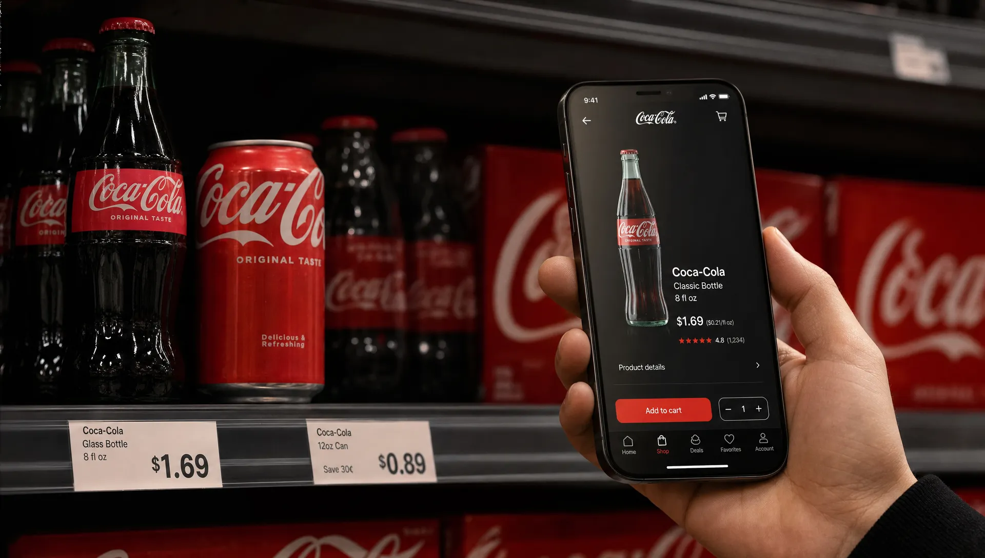
Principle 4: Design for retail, digital, and the moment of choice
Coca-Cola's brand is not experienced in a brand deck. It is experienced in moments of choice: standing in front of a cooler, scrolling a grocery app, ordering food delivery, watching a sports event, or seeing a limited edition in a convenience store.
That means a modern rebrand must perform under pressure. It has to be legible at small sizes, consistent across product families, distinctive in algorithmic retail environments, and flexible enough for local campaigns without losing the masterbrand.
For retail teams dealing with speed, performance, and personalization, working with specialists in AI-powered digital transformation for retail can help make sure the brand experience stays distinctive as it moves through commerce platforms, analytics, and optimization loops.
The key point is that brand and digital experience cannot be separated anymore. If the identity looks great on packaging but breaks in ecommerce, search, mobile menus, or personalization systems, the rebrand is incomplete.
Principle 5: Make continuity part of the launch story
The launch narrative matters as much as the design. If people think the brand is abandoning what they love, they become defensive. If they understand that the brand is sharpening what made it famous, change feels less threatening.
Coca-Cola would need to communicate what is changing and what is staying the same. The story should not be corporate self-congratulation. It should reassure people that the familiar feeling, ritual, and taste remain intact while the expression becomes more useful for today.
If you are working through audience risk, Boil's guide to rebranding without losing your audience goes deeper on the importance of understanding customer expectations before you change the signals they trust.
Principle 6: Roll out change in layers
A global brand cannot rely on a single reveal moment. The risk of confusion is too high. A stronger approach is to stage the rollout by touchpoint, audience, and market sensitivity.
Packaging may need a transition period. Retail partners need clear implementation rules. Internal teams need decision frameworks. Campaigns need to show the new system in use, not just announce that it exists. Customer service, sales teams, distributors, and local markets all need language that explains the change consistently.
A staged rollout follows the same logic behind launching a rebrand without confusing customers: reduce surprise, preserve recognition, and make the transition feel intentional everywhere people meet the brand.
What challenger brands can steal from the Coca-Cola thought experiment
Most challenger brands do not have Coca-Cola's level of fame. That can be an advantage. You have less legacy to protect, but you also have less memory in the market. The earlier you build distinctive assets, the easier it becomes to compound recognition.
The practical lessons are simple:
- Own a small set of cues before expanding the system.
- Repeat those cues across sales, product, web, packaging, content, and campaigns.
- Test your identity in buying environments, not only in presentation slides.
- Change what creates friction, but protect what creates recognition.
- Make sure every rebrand has a clear growth reason, not just an aesthetic reason.
A challenger brand should not aim to look timeless on day one. It should aim to become easier to notice and remember every time someone encounters it. That is how distinctiveness grows into brand equity.
A simple filter before any high-equity rebrand
Before approving a rebrand, leadership teams should ask three questions.
First, what memory are we protecting? If the answer is unclear, the brand may not understand its own equity.
Second, what friction are we removing? A rebrand should make the business easier to buy from, understand, sell, scale, or enter new markets with.
Third, what future does this unlock? The best rebrands do not only tidy up the past. They create a system that supports the next stage of growth.
Coca-Cola shows that the bigger the brand, the more disciplined the change must be. But the principle applies to every company with something to lose. Rebranding is not the art of becoming different. It is the art of becoming more useful without becoming less recognizable.
Frequently Asked Questions
Is Coca-Cola actually rebranding? This article uses rebranding Coca-Cola as a strategic thought experiment, not as a claim about a current Coca-Cola project. The goal is to learn from the challenges an iconic brand would face if it needed to modernize.
Why is rebranding Coca-Cola so risky? The risk comes from the depth of existing brand memory. People recognize Coca-Cola through color, script, shape, packaging, taste associations, and cultural meaning. Changing too many cues at once could reduce recognition and trigger emotional resistance.
What should Coca-Cola never change in a rebrand? A smart rebrand would be very careful with the red and white palette, script logo, contour bottle, and core feeling of refreshment. These assets carry enormous recognition and should be refined rather than casually replaced.
What can challenger brands learn from Coca-Cola? Challenger brands can learn to build and protect distinctive assets early. Even if your brand is young, consistent repetition of colors, shapes, language, and experience cues helps buyers remember you faster.
Does a rebrand always require a new logo? No. Many effective rebrands focus on strategy, messaging, architecture, experience, packaging, or digital systems. A logo change is only useful when it solves a real business and recognition problem.
Build a rebrand that compounds recognition
The best rebrands do not wipe the slate clean. They protect the assets that customers already know, remove the friction that limits growth, and create a system strong enough for the next market move.
Boil helps ambitious challenger brands turn branding, rebranding, go-to-market strategy, creative design, web, and digital experiences into market share growth. If your brand needs to evolve without losing its edge, start with the equity worth protecting and build from there.
