A logo can look impressive on a presentation slide and become an indistinct smudge in a browser tab. The best logo rebrands solve that mismatch without stripping away the cues people already recognize: a silhouette, a color combination or a distinctive piece of lettering.
These seven examples show different ways to make an identity work harder on small screens. Some simplify an existing symbol. Others introduce a compact alternative to a wordmark. The useful lesson for challenger brands is not to copy their appearance, but to understand what each redesign preserves, removes and makes easier to recognize.
Why small screens force logo changes
A website header, app icon and favicon place different demands on an identity. A full company name might remain readable in a mobile navigation bar but become useless inside a 16-pixel browser icon. Fine outlines can disappear, closely spaced shapes can merge and decorative effects can obscure the underlying form.
That does not mean every brand needs a shorter name or a flat symbol. It means the identity needs appropriate versions for different jobs.
A refresh adjusts existing assets while preserving their basic structure. A fuller redesign changes that structure more substantially. Neither is inherently better. The right intervention depends on whether the problem is poor rendering, weak differentiation or a mismatch between the brand and its business.
How we selected the best logo rebrands
This list prioritizes four qualities: a distinctive silhouette, simpler internal detail, continuity with existing brand cues and flexibility across compact placements.
“Improved” here describes an assessment of those design qualities, not a claim that controlled testing proved higher recognition. The linked sources document the identities and their development. They do not establish that a logo change independently increased sales, downloads or brand recall.
The examples are numbered for navigation, not ranked by commercial performance. Familiar global brands also benefit from exposure that a challenger cannot assume. Where an established company can show a symbol alone, an unfamiliar business may still need its name beside it.
1. Google, 2015: a compact symbol with familiar color cues
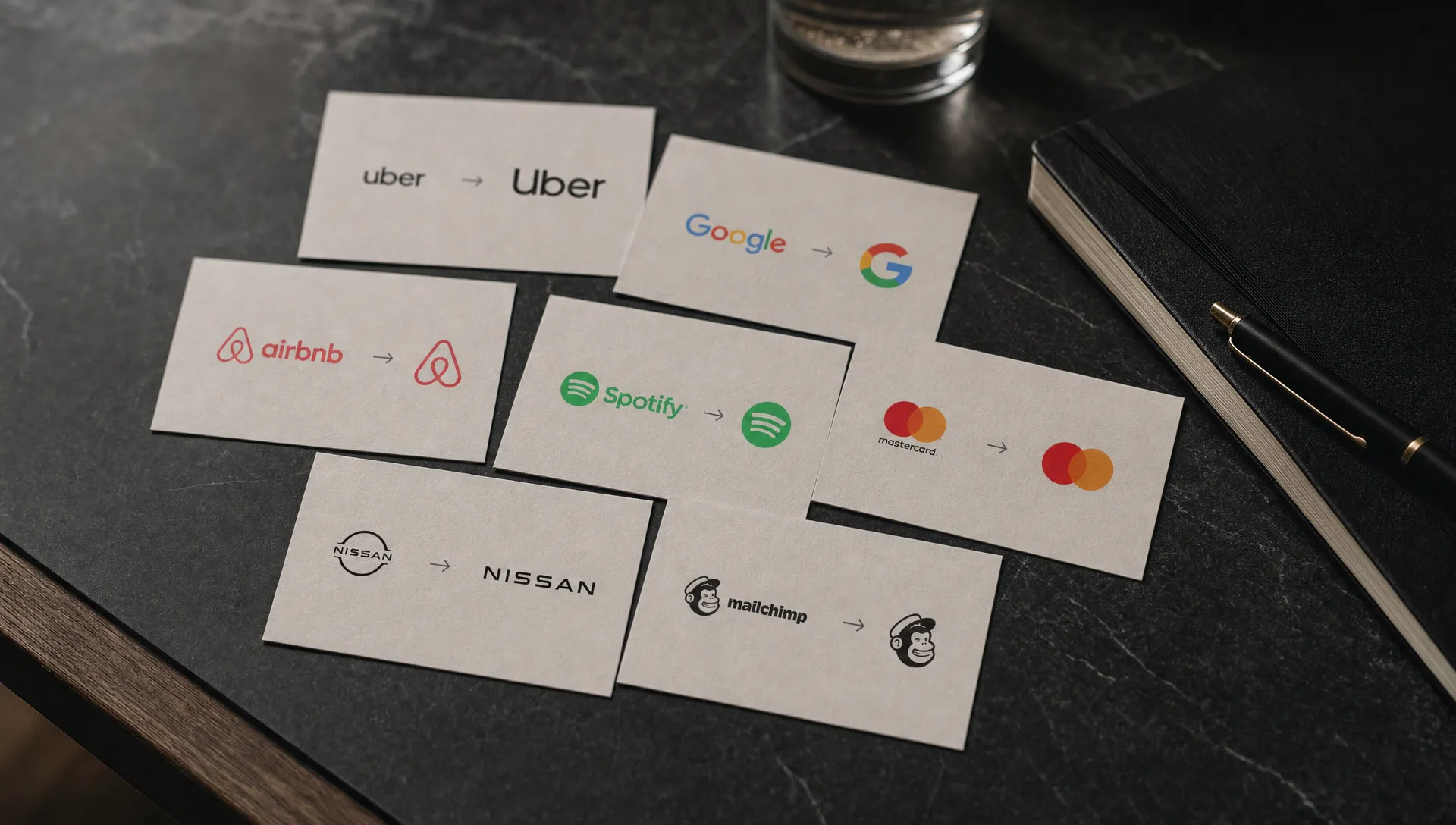
Google’s previous primary wordmark used serif lettering. Its 2015 identity update introduced a geometric sans-serif wordmark, a multicolored capital G and animated dots for different product interactions.
The important small-screen move was not simply removing serifs. Google created a family of related assets rather than asking one wordmark to fit every space. The full name could remain prominent where room allowed, while the G provided a compact identifier.
Among the best logo rebrands, this is a clear example of preserving recognition through color while changing the shape that carries it. The G retains the familiar palette without squeezing six letters into an icon-sized footprint.
Its limitation is equally useful: Google’s color sequence already had substantial recognition. A new business cannot expect a multicolored initial to communicate its identity immediately.
What challengers can borrow: Develop the wordmark and compact mark together. They should share recognizable characteristics, but they do not have to contain identical information. Test the compact version beside competitors’ initials, because an isolated letter that looks distinctive in a brand presentation may be generic in a browser tab or app grid.
2. Instagram, 2016: keep the camera, remove the camera hardware
Instagram’s original app icon resembled a physical camera, complete with shading, surface detail and a small rainbow accent. The 2016 redesign replaced that illustration with a simplified camera outline over a colorful gradient.
The redesign retained the central recognition cues: a rounded-square body, a prominent lens and a smaller upper-right detail. It removed much of the visual information that depended on seeing the icon at a larger size.
Instagram belongs among the best logo rebrands for small-screen analysis because it separates the idea of a camera from a detailed depiction of one. The gradient provides an additional identifying cue, while the camera outline supplies a recognizable structure.
There is a trade-off. Thin white linework can weaken when reproduced too small or placed against an unsuitable background. The app tile and an outline-only logo therefore need different handling.
What challengers can borrow: Identify the minimum shapes that carry the concept before removing detail. Simplification works when the remaining elements still say something specific. A cleaner icon that could belong to any photo app is not necessarily a stronger identity.
3. Slack, 2019: reduce the variables inside the mark
Slack’s earlier hashtag-style symbol combined multiple colors, angled strokes and overlapping elements. In its 2019 redesign announcement, the company explained the difficulties of reproducing that identity consistently across different backgrounds and applications.
The replacement uses four colors and a more controlled arrangement of rounded shapes. The design retains a loose connection to the original intersecting structure without relying on the same complicated overlaps.
Consistency earns Slack a place among the best logo rebrands. At small sizes, each extra intersection introduces another opportunity for shapes to merge or become unclear. The newer mark has more stable components and a more predictable outline.
It is not automatically recognizable because it is simpler. Slack still needs consistent use, adequate spacing and appropriate background treatments. Its multicolored symbol also requires an approved alternative when color reproduction is unavailable.
What challengers can borrow: Count the conditions under which your current mark becomes difficult to reproduce. If teams regularly improvise colors, backgrounds or spacing, the problem may be structural rather than a lack of guidelines. A redesign should reduce those workarounds, not merely replace the artwork that requires them.
4. Deliveroo, 2016: turn an illustration into a distinctive silhouette
Deliveroo’s earlier identity depicted a kangaroo carrying a delivery bag. Its 2016 redesign with DesignStudio replaced that more literal illustration with an angular kangaroo-head symbol and a distinctive wordmark.
The new symbol concentrates recognition into an unusual silhouette. Its ears and sharply defined body remain the main visual information, rather than small details within a character illustration.
For a challenger, this is one of the best logo rebrands to study when a mascot has become too complicated for everyday digital use. The redesign does not abandon the animal association; it expresses that association through fewer, more deliberate shapes.
The broader identity also matters. Color, typography and repeated use help teach audiences what the abstracted symbol represents. The silhouette alone does not explain food delivery to someone encountering the business for the first time.
What challengers can borrow: Look for a distinctive fragment inside an existing mascot or illustration. Ears, a profile or a characteristic posture may carry more identifying value than clothing, props or facial details. Preserve the useful feature, then check whether the simplified result remains different from other marks in your category.
5. Microsoft, 2012: give the wordmark a compact companion
Microsoft’s earlier corporate logo relied on a bold, italic wordmark. The company’s 2012 identity announcement introduced a lighter wordmark alongside a four-color square symbol.
Unlike an approach that simply shrinks the company name, this system gives the identity two complementary forms. The name handles explicit identification. The square arrangement provides a compact asset connected to familiar visual associations across Microsoft’s products.
This example broadens what the best logo rebrands can achieve: sometimes the answer is not making the existing wordmark more legible at microscopic sizes, but giving it an appropriate companion.
The symbol’s simple geometry also makes it comparatively straightforward to reproduce. However, colored squares are not inherently ownable. Their arrangement, proportions and sustained connection to Microsoft do much of the identifying work.
What challengers can borrow: Separate the need to read a name from the need to identify a source quickly. A compact symbol can support the latter, but an unfamiliar brand should normally introduce it alongside the name before expecting it to work independently. Reducing the amount of text is not the same as building recognition.
6. Mastercard, 2016 and 2019: simplify first, remove the name later
Mastercard’s redesign unfolded in stages. The identity developed with Pentagram simplified its familiar overlapping red and yellow circles in 2016, removing the earlier striped intersection and separating the name from the symbol. In 2019, the company moved to symbol-only use in selected contexts.
That sequence matters. The compact asset was not an unrelated invention. It refined a shape and color relationship that already carried recognition.
Mastercard stands out among the best logo rebrands because the small-format advantage comes from protecting a distinctive configuration, not from adding another visual device. Two overlapping circles can occupy a compact space without forcing lettering across their center.
The lesson is not that names are unnecessary. Boil’s analysis of why Mastercard removed its name explores the role of established recognition in that decision.
What challengers can borrow: Treat symbol-only use as a decision that depends on audience recognition. Before dropping your name, check whether intended customers can identify the symbol without contextual hints. Recognition within your own team is not evidence that the market is ready. Keep named versions available for unfamiliar audiences and higher-clarity situations.
7. Burger King, 2021: remove the surrounding clutter
Burger King’s previous logo placed tilted lettering and bun shapes inside a blue swoosh, with additional dimensional effects. Its 2021 visual identity announcement introduced a flatter logo that returned the focus to the name between two bun shapes.
The redesign removed an outer element competing with the central food-related silhouette. It also reduced reliance on effects that become less useful as reproduction size decreases.
This earns its place among the best logo rebrands through selective subtraction. The design retains an immediately relevant brand idea rather than replacing the whole identity with a generic monogram.
There is still a small-screen constraint: the logo contains lettering. A simplified badge can remain recognizable at a size where the words are no longer comfortably readable. Those are different outcomes and should be tested separately.
What challengers can borrow: Examine the perimeter of your logo as carefully as its center. Swooshes, frames and shadows may consume space without adding much identifying value. Removing them can give the important shapes more room, provided the overall mark does not lose the feature customers use to recognize it.
How to test whether a redesign actually works
The best logo rebrands offer useful design principles, but your own audience and interface should determine the final choice. Compare the existing and proposed identities in real placements, not only as large artwork on neutral backgrounds.
Test several sizes and conditions
Use the following as a practical starting set, not universal minimum-size standards. Test in CSS pixels on actual devices, since display density and rendering can change the result.
| Test condition | What to check | Warning sign |
|---|---|---|
| 16-pixel favicon | Silhouette and internal separation | Shapes merge into an indistinct block |
| 24- and 32-pixel placements | Distinctive details and visual balance | A defining feature disappears |
| Mobile website header | Name readability and navigation space | The logo crowds useful controls |
| App-icon crop | Padding and survival of key features | Rounded corners cut off identifying shapes |
| Light, dark and monochrome versions | Shape recognition across conditions | Identification depends entirely on color |
Give participants brief exposure to each option, then ask them to identify or match it among plausible alternatives. Randomize the order and distinguish existing customers from unfamiliar viewers. Otherwise, familiarity can be mistaken for design quality.
Match the test to the business
A professional-services firm such as Clair Gjertsen Weathers PLLC faces a different identification task from a food-delivery app. A compact mark needs to support clear firm naming and readable service information, not replace them prematurely. This is an application of the testing principle, not an assessment of the firm’s identity.
Accessibility also extends beyond the artwork. Logotypes have an exemption from WCAG’s text-contrast requirement, but that does not make a hard-to-see logo useful. Interactive controls still need appropriate treatment, and a linked logo needs an accessible name that communicates its destination.
Frequently asked questions
Does a simpler logo always improve recognition? No. Simplification can remove the feature people remember. The best logo rebrands reduce unnecessary complexity while retaining distinctive cues. Test recognition and confusion with competitors, rather than assuming fewer shapes will produce a better result.
Is a logo refresh enough for mobile use? Often. Adjusting spacing, strengthening fine details or adding an approved compact version may solve the problem. A larger redesign is more appropriate when the underlying identity lacks differentiation or no longer fits the business.
Should negative launch reactions stop a redesign? Not automatically. Initial dislike, practical usability and sustained recognition are different measures. Investigate specific problems, such as illegibility or mistaken identity, rather than treating every preference expressed on social media as equivalent evidence.
Build an identity that works where customers see it
A useful redesign preserves what customers recognize and fixes what prevents that recognition from carrying across screens. It should also make implementation easier for the people managing your brand.
If your identity no longer supports your ambitions, explore Boil’s branding and rebranding services. Start with the business problem, then define the visual system needed to solve it.
