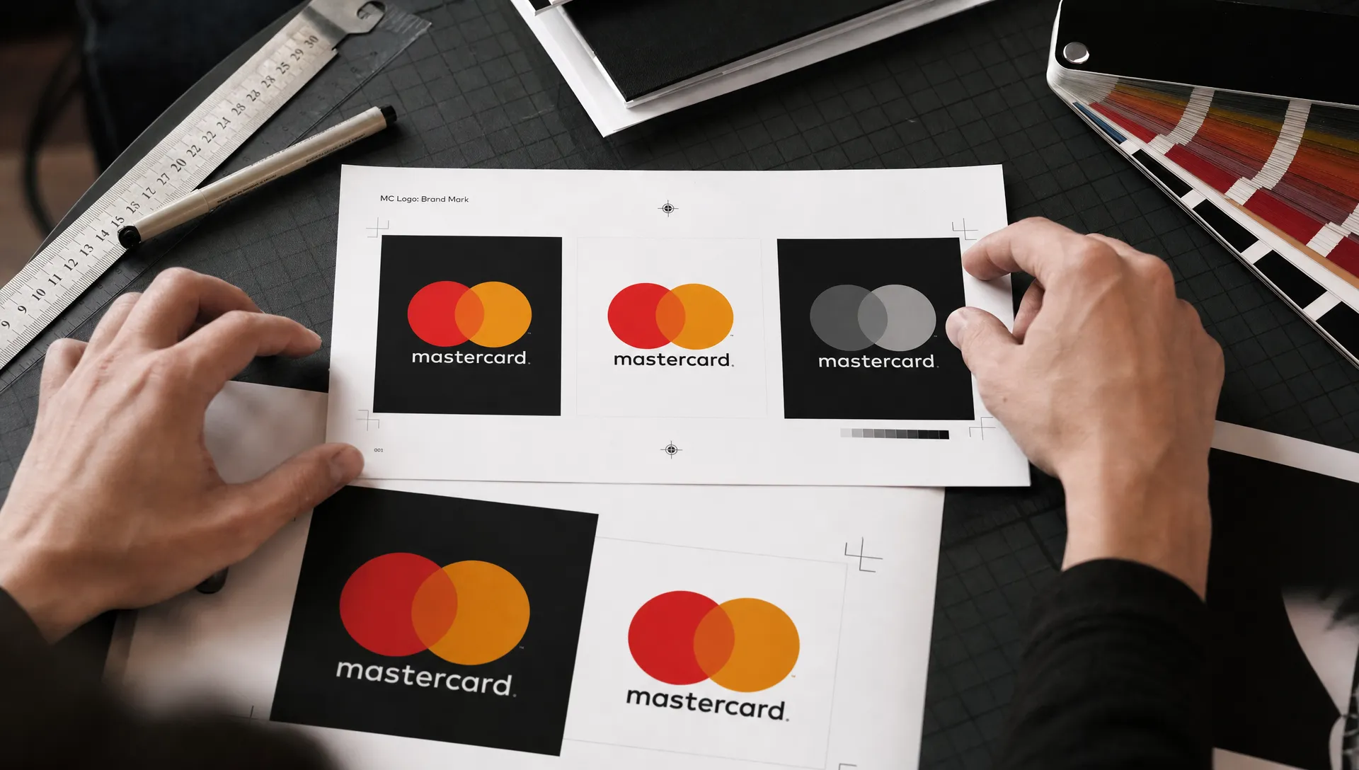
Removing a company name from its logo can look like a branding contradiction. But rebranding Mastercard was not about making the company anonymous. It was about allowing an already familiar symbol to do more of the work.
The change happened in stages. In 2016, Mastercard simplified its identity while keeping its name beneath the overlapping circles. In 2019, it introduced the symbol without the wordmark for selected uses. Understanding that sequence matters: this was not a sudden leap from a named business to an unexplained icon.
For challenger brands, the useful question is not whether a nameless logo looks cleaner. It is whether customers can still identify the business when the name disappears.
The circles built recognition long before the name disappeared
Mastercard’s overlapping circles date back to the Master Charge identity introduced in 1968. The name changed to MasterCard in 1979, but the basic visual relationship survived subsequent redesigns.
That continuity gave the company something valuable to preserve. Customers did not have to learn a completely unfamiliar shape each time the identity evolved.
| Identity era | What customers saw | What carried forward |
|---|---|---|
| Master Charge, 1968 | Overlapping red and yellow circles with the Master Charge name | The two-circle structure |
| MasterCard, from 1979 | The new name within an evolving circle-based identity | Familiar colors and overlap |
| Mastercard, 2016 | Flat circles with an orange overlap and a lowercase wordmark underneath | The established visual signature |
| Mastercard, 2019 | The circles without the wordmark in selected applications | Recognition without written identification |
The eventual simplification depended on this accumulated familiarity, not just the quality of the new drawing.
Rebranding Mastercard involved two separate decisions
In 2016, the identity became a more flexible system
The 2016 redesign was developed by Pentagram, with partners Michael Bierut and Luke Hayman. It replaced the previous striped overlap and lettering across the circles with simpler geometry, a clear orange intersection and a lowercase wordmark below the symbol.
Separating the name from the circles was consequential. The symbol could now function as a distinct asset rather than a background for lettering.
The identity also supported Mastercard’s positioning beyond the physical payment card. As payments moved across devices and interfaces, the brand needed to remain recognizable in places where the familiar card-shaped object might not appear.
In 2019, the symbol gained permission to stand alone
The later announcement removed the name from the brand mark in selected contexts, including cards, retail acceptance environments and major sponsorship properties.
In its January 2019 announcement, Mastercard reported that more than 80% of people spontaneously recognized the symbol without its name.
That figure needs attribution. It is a company-reported finding, not independent evidence presented in the announcement, and the release does not supply enough methodological detail to apply it universally across markets or audiences.
The sequence behind rebranding Mastercard was therefore deliberate: simplify the system first, then expand the symbol’s independent role once the company considered recognition sufficient.
Why the circles could replace the wordmark
The circles retained the identity’s most persistent features: two overlapping shapes, their familiar arrangement and the red-to-yellow color relationship.
The orange intersection makes the overlap explicit. It also gives the mark a visual expression of connection, appropriate for a network linking participants in a payment system. That interpretation is useful, but the logo does not need a lengthy explanation to function. Its immediate job is identification.
Removing the lettering also stopped the name from competing with the symbol. Instead of asking viewers to process a word laid across a detailed graphic, the revised identity presented a compact visual unit.
The strongest strategic insight from rebranding Mastercard is that simplification can preserve equity rather than erase it. The company removed elements while retaining what people were already accustomed to seeing.
That is different from replacing a familiar identity with something unrelated. A challenger considering a similar move should first establish which parts of its identity customers actually remember. An internally popular design element is not necessarily a distinctive asset in the market.
Small-screen usability strengthened the case
A logo that works on a presentation slide may become difficult to read inside a payment button or a compact mobile interface. Letterforms lose clarity as space shrinks, while unnecessary detail becomes visual noise.
Mastercard’s simplified geometry gave its symbol fewer competing elements. Removing the wordmark in approved uses also avoided forcing tiny text into spaces where it could contribute little useful information.
However, a recognizable visual symbol is not automatically an accessible interface. A screen reader cannot infer the meaning of two colored circles from their appearance. The W3C’s guidance on functional images explains that text alternatives should communicate an image’s purpose or function.
For a payment acceptance mark, that might mean an accessible label such as “Mastercard accepted.” If the same information is already provided in adjacent text, implementation should avoid unnecessary duplication.
For teams studying rebranding Mastercard, the distinction is practical: reduce visual clutter without removing information people need to complete a task. Test the mark in real interfaces, not only on a designer’s screen, and check recognition alongside keyboard and screen-reader usability.
A visual change is not the same as a different business
Dropping the wordmark from selected placements did not mean Mastercard stopped being Mastercard. Nor did it announce a new payment network, change every cardholder’s relationship with their bank or eliminate the company’s written name.
The name still has a role in language, corporate communication and contexts where explicit identification is necessary. A symbol-only application is one part of a broader identity system, not a rule that words must disappear everywhere.
The redesign supported a business narrative about digital payments and a wider role beyond cards. It did not, by itself, prove that the company had achieved a transformation or caused a particular commercial result.
That distinction prevents a common case-study mistake: treating a visible logo change as evidence for every subsequent business success. Recognition can justify a design decision without establishing revenue impact or customer preference.

What challenger brands should take from the decision
Test recognition without giving away the answer
Asking existing customers whether they like a new logo will not establish whether it can replace your name. Neither will showing the symbol immediately after telling participants which brand is being researched.
A more useful test starts with the asset in a realistic context and asks people to identify it without prompting. Include relevant prospects as well as loyal customers. Someone who buys from you regularly has had more opportunities to learn your identity than someone encountering it for the first time.
Check for mistaken attribution too. A symbol can look familiar while reminding people of the wrong company. Test small sizes, monochrome applications and placements alongside competitors.
The lesson from rebranding Mastercard is not that every established business should remove its name. It is that the amount of explanation an identity needs should follow evidence about recognition.
For businesses still building familiarity, retaining a clear name-and-symbol combination may be the stronger choice. Boil’s guidance on rebranding without losing your audience explores the wider challenge of changing an identity without discarding customer understanding.
Define where the name must stay
A flexible identity system can accommodate both named and symbol-only versions. There is no need to force one configuration into every setting.
An existing customer opening an app may recognize a compact icon immediately. A prospect seeing an unfamiliar business at an event may need the name, a description and a clear reason to care.
Document those differences. Specify which version belongs on product interfaces, partner materials, invoices and physical signage. Define minimum sizes and background treatments so individual teams do not improvise conflicting solutions.
Physical implementation deserves the same attention. A Melbourne retailer might coordinate commercial painting services with updated signage so its premises reflect the approved palette. The work implements the identity, but the business still needs to decide what customers should recognize when they arrive.
Rebranding Mastercard illustrates why deployment rules matter: permission to omit a name in one context does not make omission the right choice everywhere.
Separate design approval from proof of effectiveness
A well-resolved identity can still underperform if the audience does not understand it. Before launch, define the outcomes you expect the change to support.
For a symbol-only application, useful measures include unprompted identification, confusion with competitors and successful completion of relevant interface tasks. After launch, monitor customer questions and partner implementation problems alongside those measures.
Commercial outcomes require more care. Sales can change because of pricing, distribution, product improvements or marketing investment. A new logo appearing at the same time does not establish causation.
This is also why learning from rebranding failures is useful: the decision should be assessed against the problem it was meant to solve, not the intensity of the reaction alone.
If recognition is weak, the appropriate response may be to restore the name in particular placements rather than abandon the entire identity. Build that flexibility into the system before rollout.
Frequently asked questions
Who designed Mastercard’s updated logo? Pentagram developed the 2016 identity, with Michael Bierut and Luke Hayman leading the work. That redesign established the simplified circles and separate wordmark that preceded the 2019 symbol-only applications.
Why did Mastercard remove its name from the logo? The company considered the circles sufficiently recognizable to stand alone in selected uses. Digital applicability and its broader positioning beyond physical cards also informed the evolution. Rebranding Mastercard involved using established recognition, not assuming that a simpler logo would automatically create it.
Did Mastercard change its company name in 2019? No. The announcement concerned removing the wordmark from the brand mark in selected contexts. Mastercard remained the company’s name and continued to be used in written communication.
Should a smaller brand use a logo without its name? Only where recognition and context support it. A challenger may benefit more from consistently pairing its symbol with its name until customers and prospects can reliably identify the symbol alone.
Start with what customers recognize
Before removing anything from your identity, establish what it contributes. If you are planning a rebrand, explore Boil’s branding and go-to-market approach to connect the design decision with your positioning, audience and growth goals. The right outcome may be a simpler logo, but simplicity should follow the strategy.
